Mechanics Bank. Helping a 130-year-old bank find their community-serving voice.
Mechanics Bank is a full-service community bank in Ohio that’s remained independently managed for over 130 years. The new site provides a user-friendly experience that brings Mechanics’ service-forward, natural and human personality to the forefront.
Their existing site was outdated and slow, making it frustrating to use. Our challenge was to build an entirely new site that won’t get stagnant. We needed to provide a better back-end authoring experience to simplify site upkeep. From a design and content approach, it needed to represent the brand wholly and highlight Mechanics’ unique programs as reasons to believe this is “a bank that means more.”
I collaborated closely with my agency team to bring this project to life. My role included front-end development and visual/UX design for the website redesign, blog, and newsletter. From a technical side, we designed the site using Adobe XD and Photoshop, and developed using HTML5 & CSS/Sass, WordPress, and Advanced Custom Fields.
My Roles
- Front-end development
- Digital/UX design
- Email design
Team
- Copywriter: Annie Ertle
- Programmer/Designer: Ted Boyer
- Digital Director: Mike Krueger
- Senior Account Executive: Zorina Kennedy
- Copy Editor/Proofreader: Holly Kirby
Work completed in 2018–2019 for Brokaw
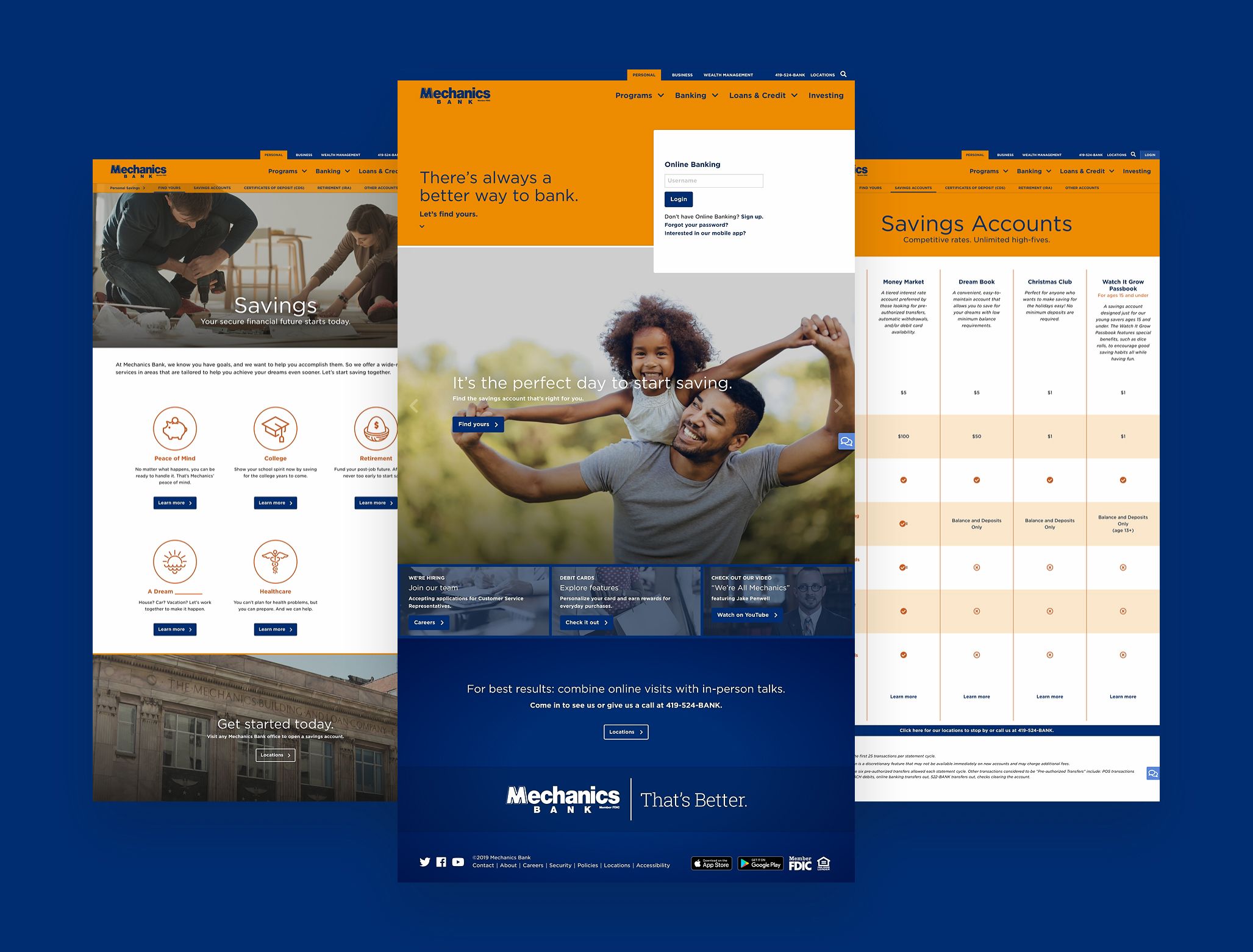
Visual overhaul. We developed a fresh look for the website to bring Mechanics’ brand personality to the forefront. Using carefully-considered design elements and improved content architecture, the new site feels friendly, modern, and engaging. I was brought in to this project at an early stage to help expand on existing wireframes and designs, code the site’s sections and components, and refine the overall visual design, through to the site launch.
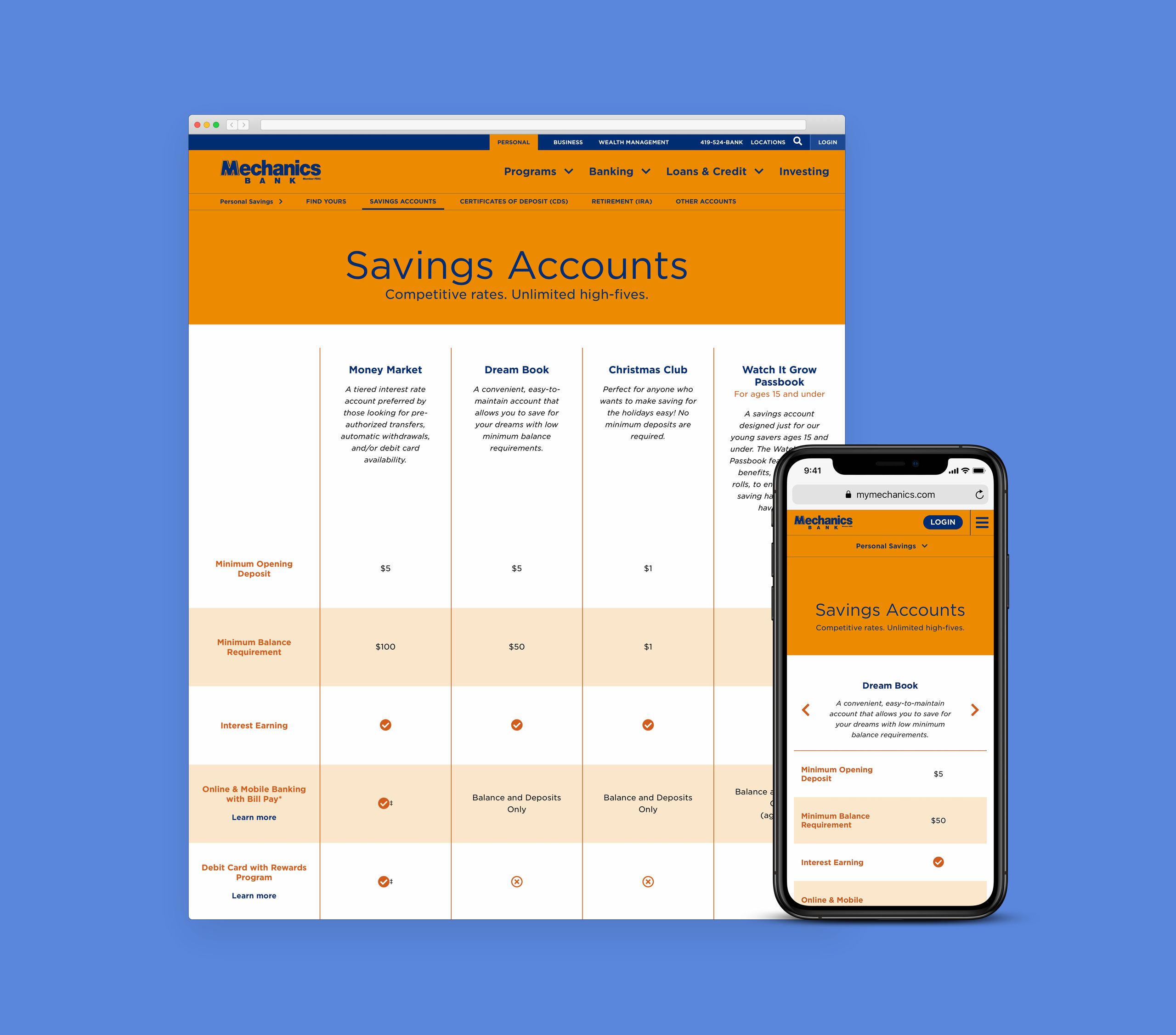
Smart design patterns. From navigation to the flow of pages, we approached the site with strong attention to detail and a focus on usability. One roadblock was figuring out how to best display the product comparison information across devices. I researched and prototyped responsive table patterns, then using this work, my team and I developed a solution that presents this complex data in a clear and intuitive way.
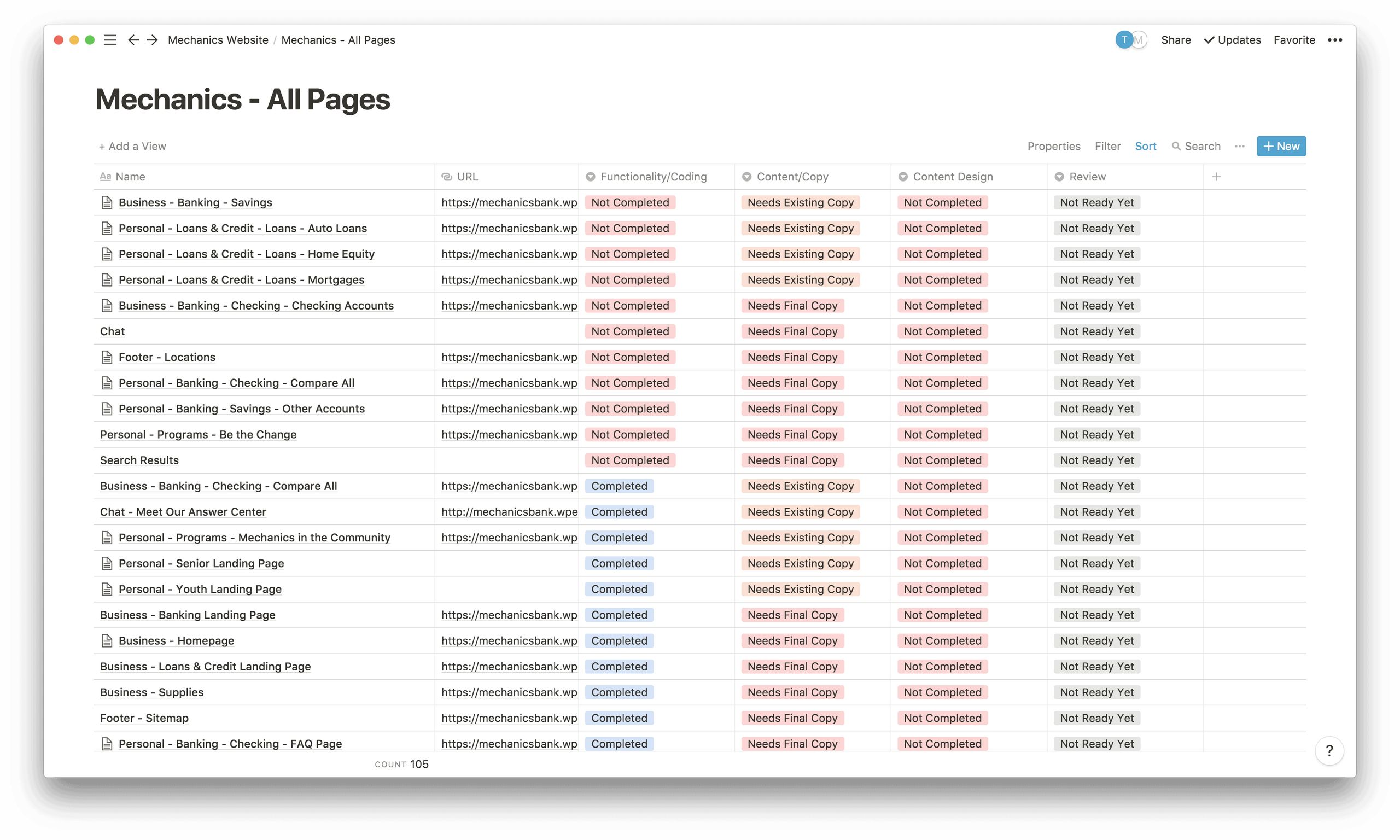
Improved project workflow. I introduced Notion to our agency to keep track of pages, content, and overall progress during the website redesign. My team and I leveraged this tool in a collaborative way to keep track of the site’s 100+ pages. Having a single point of reference for this project was immensely helpful, and as a result of this improved workflow, we were able to focus on what was important during each step.
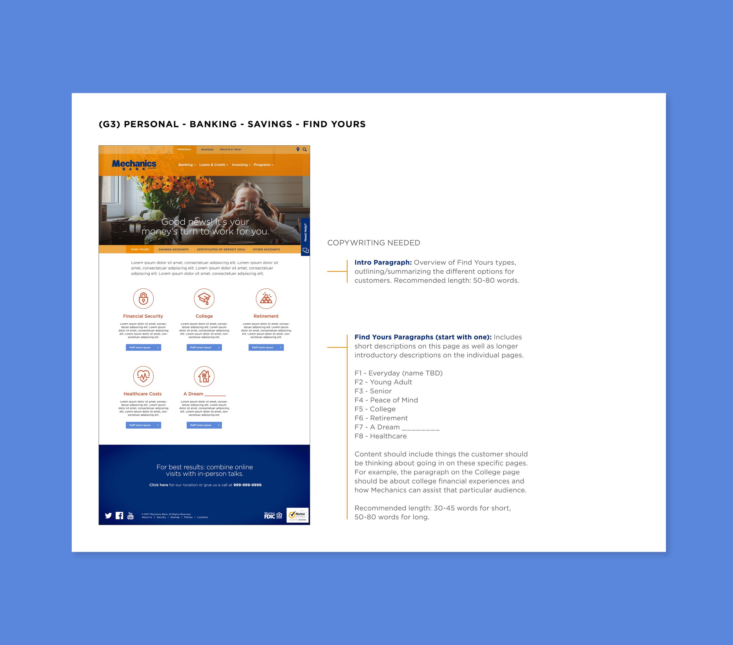
Copywriter onboarding. To help our copywriter understand the status of the site and where missing content was, I created PDFs which outlined the exact pieces to fill in. Each document included screenshots of the site pages, descriptions of copywriting needed, word counts, and important considerations.
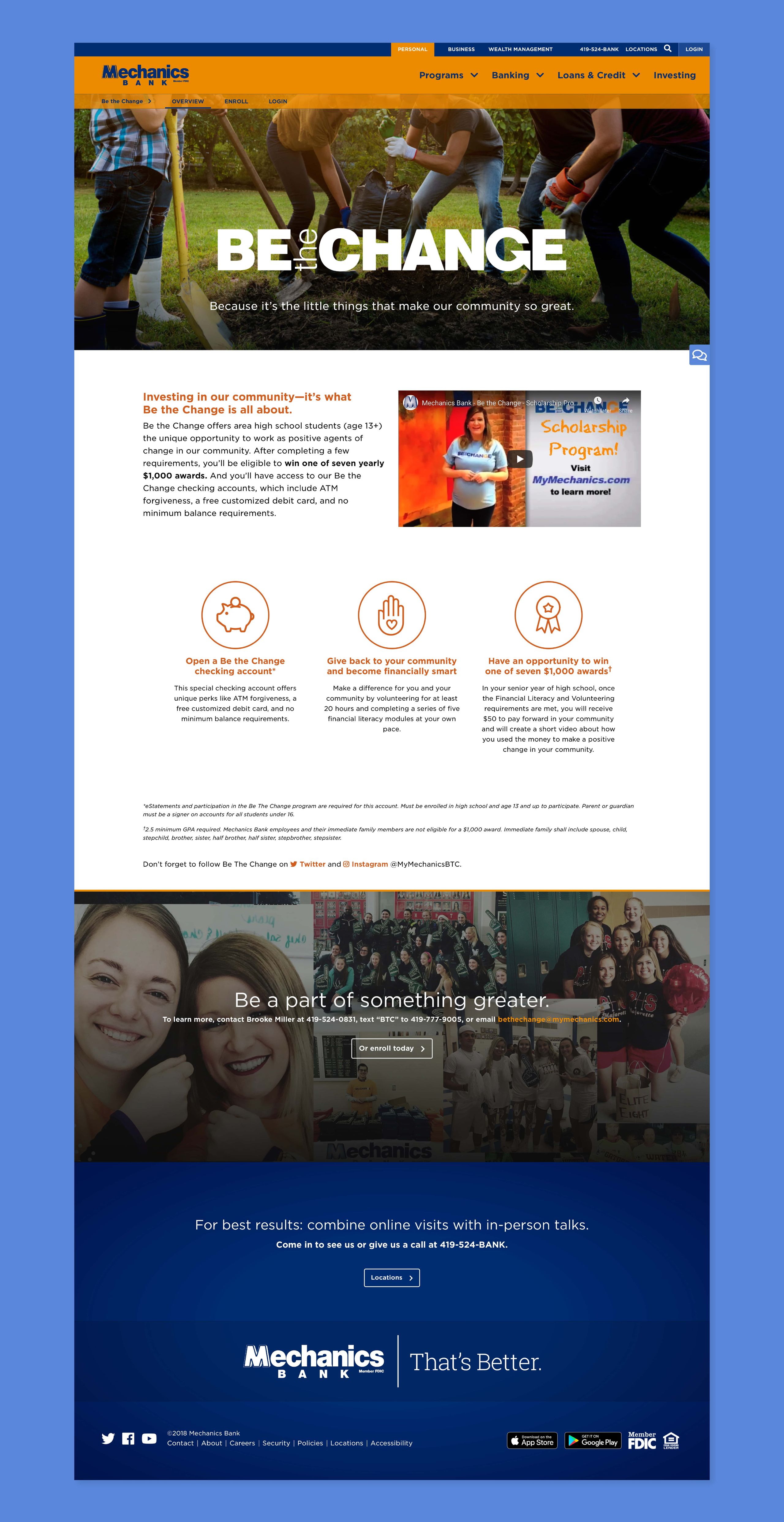
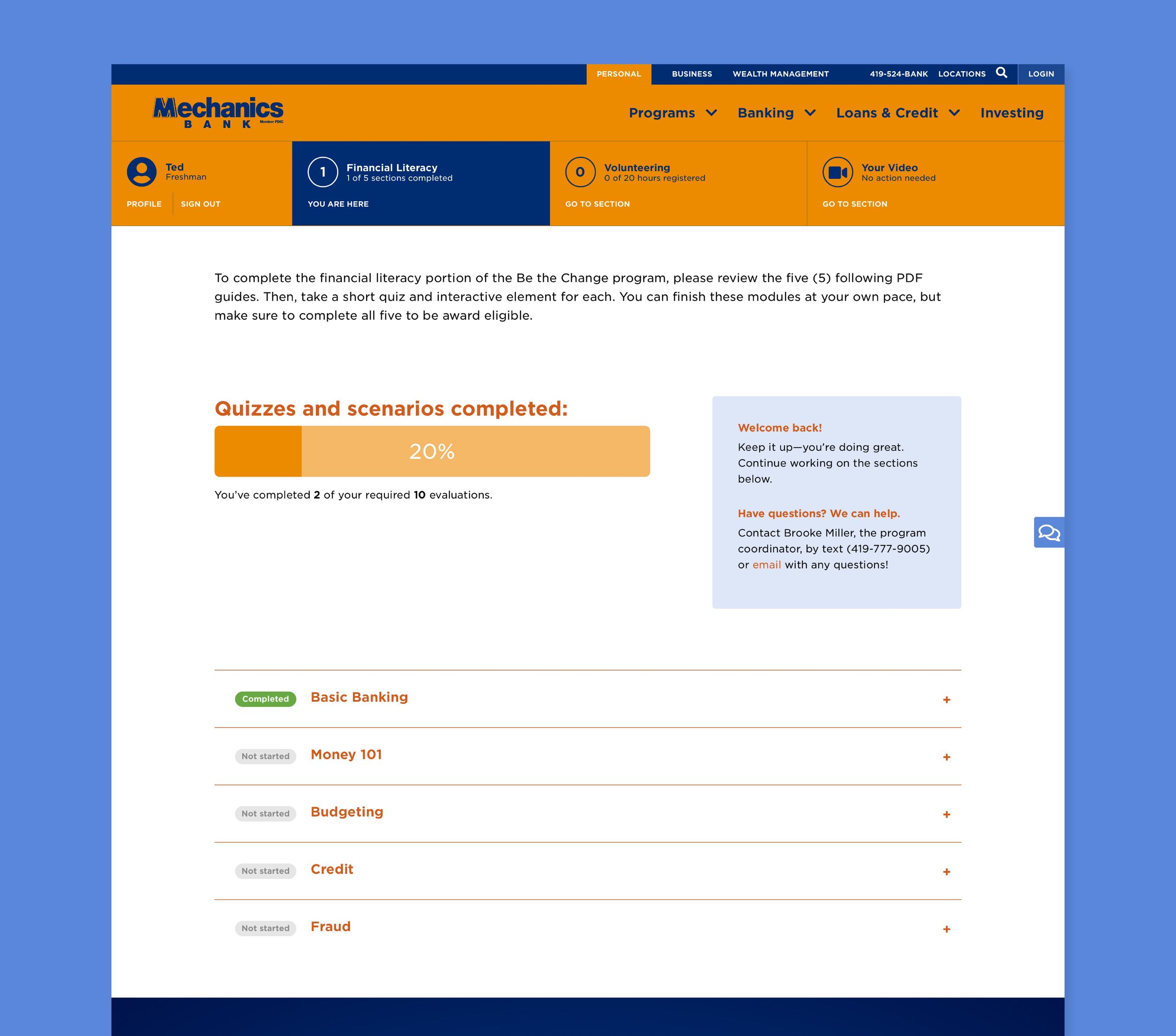
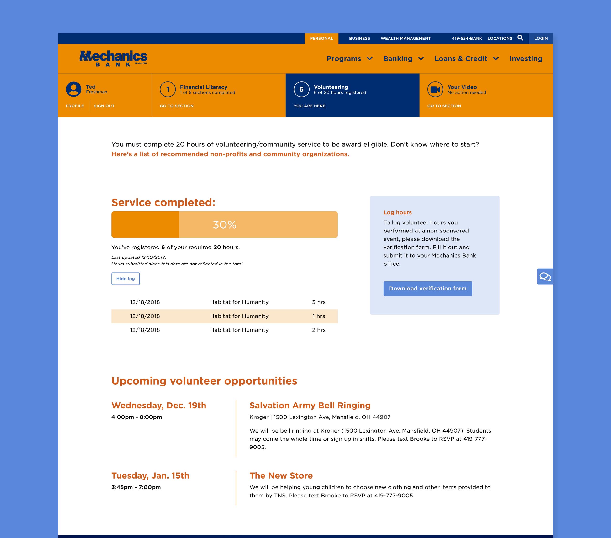
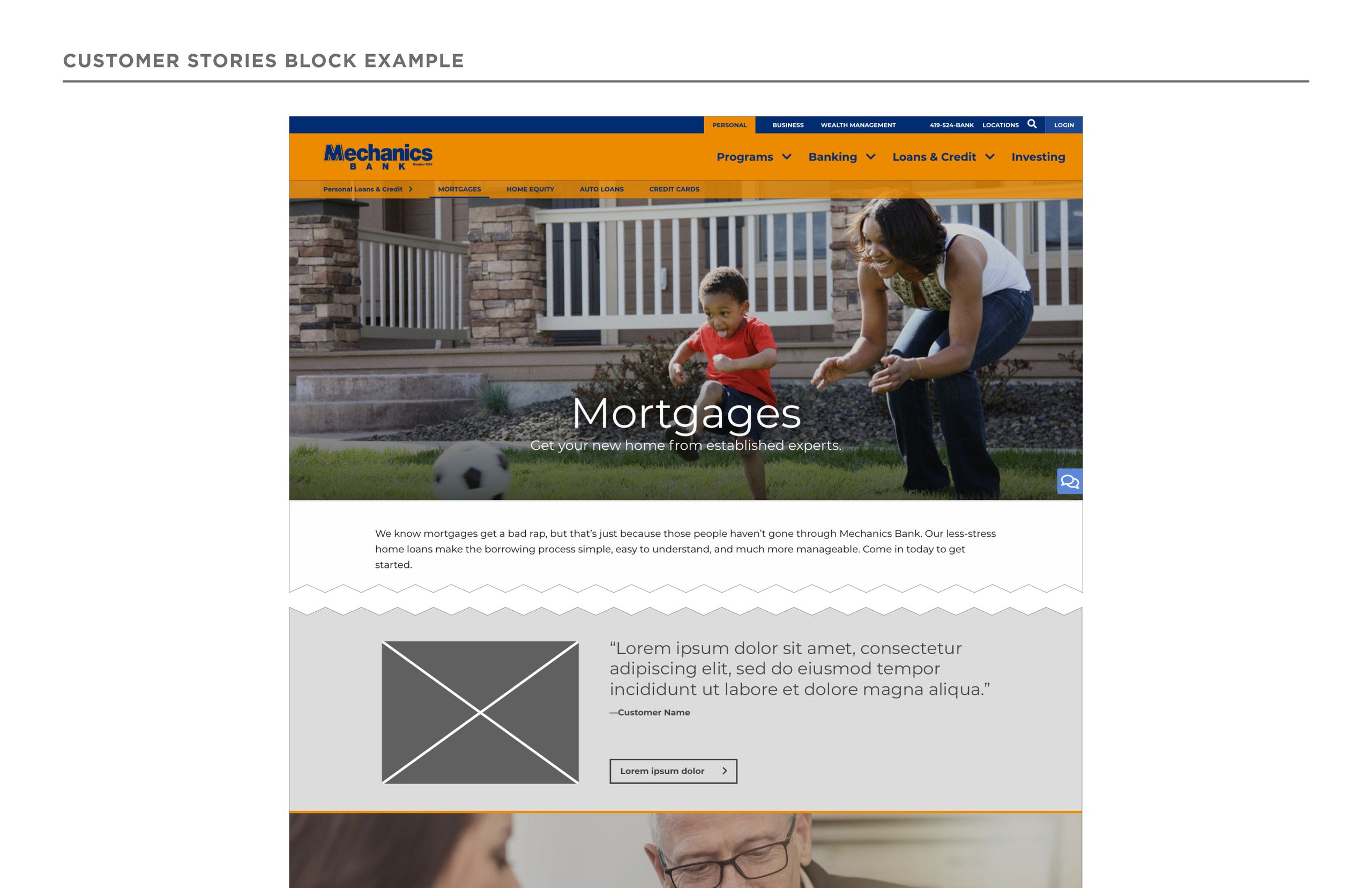
Bank programs revamped for digital. Be the Change offers area high school students the unique opportunity to work as positive agents of change in their community and win awards. We designed comprehensive digital functionality—allowing students to fully keep track of their financial literacy progress, investment in their community, and more.
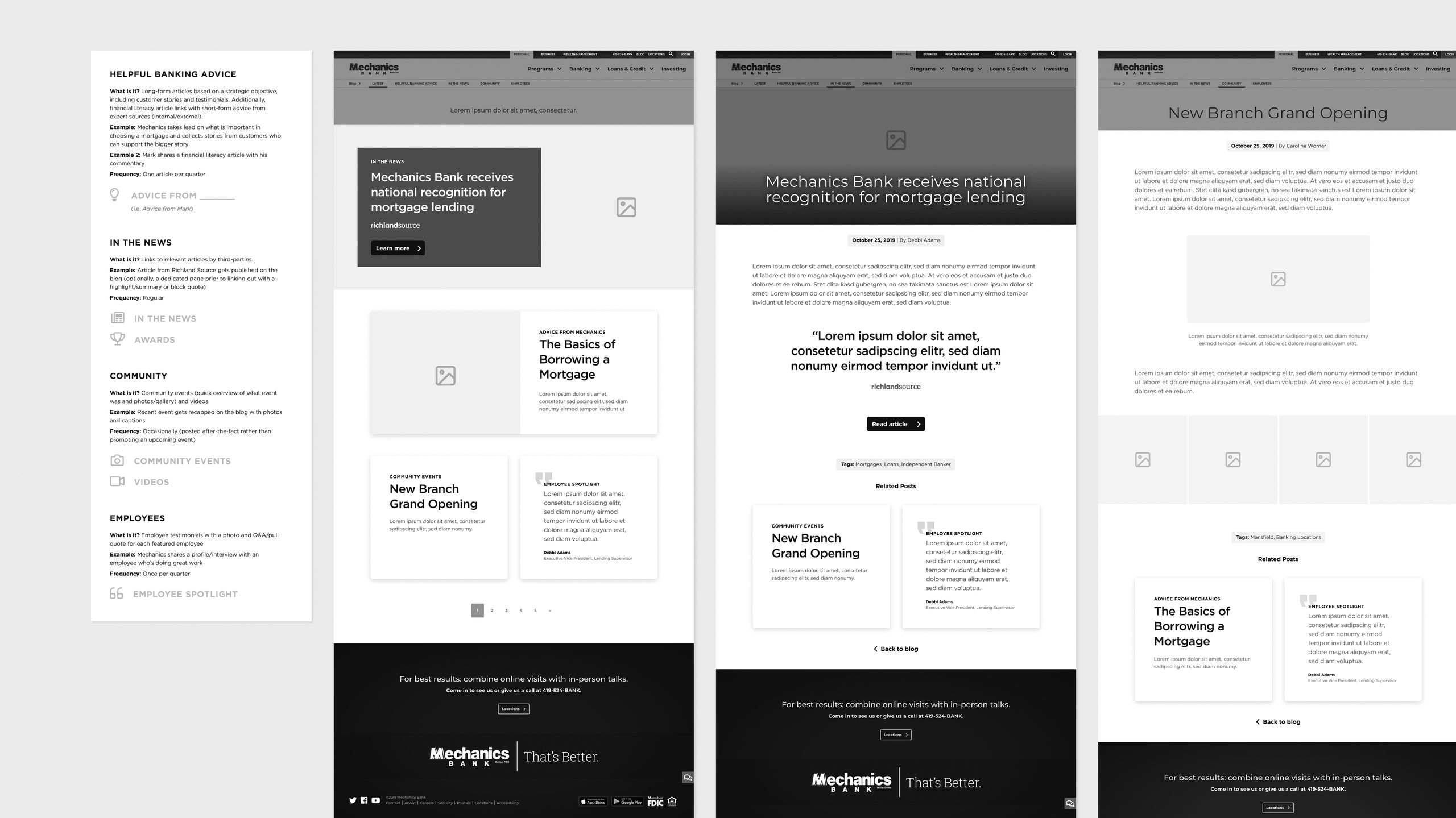
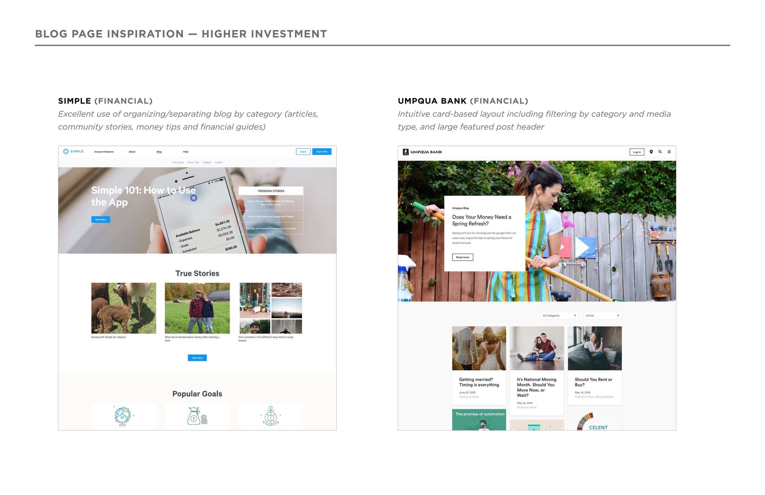
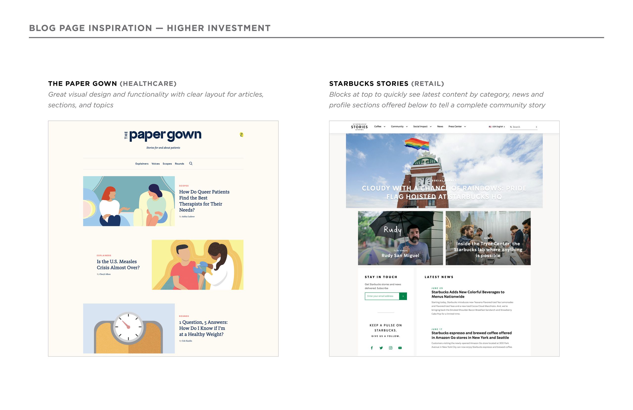
Adding community value. After we launched the site in 2019, our team strategized to further enhance the customer experience. I researched well-designed blog examples from various industries, designed the new Mechanics Bank blog, and added sections within the site that linked back to it. We aimed to make the blog an integral, customer-centric element.
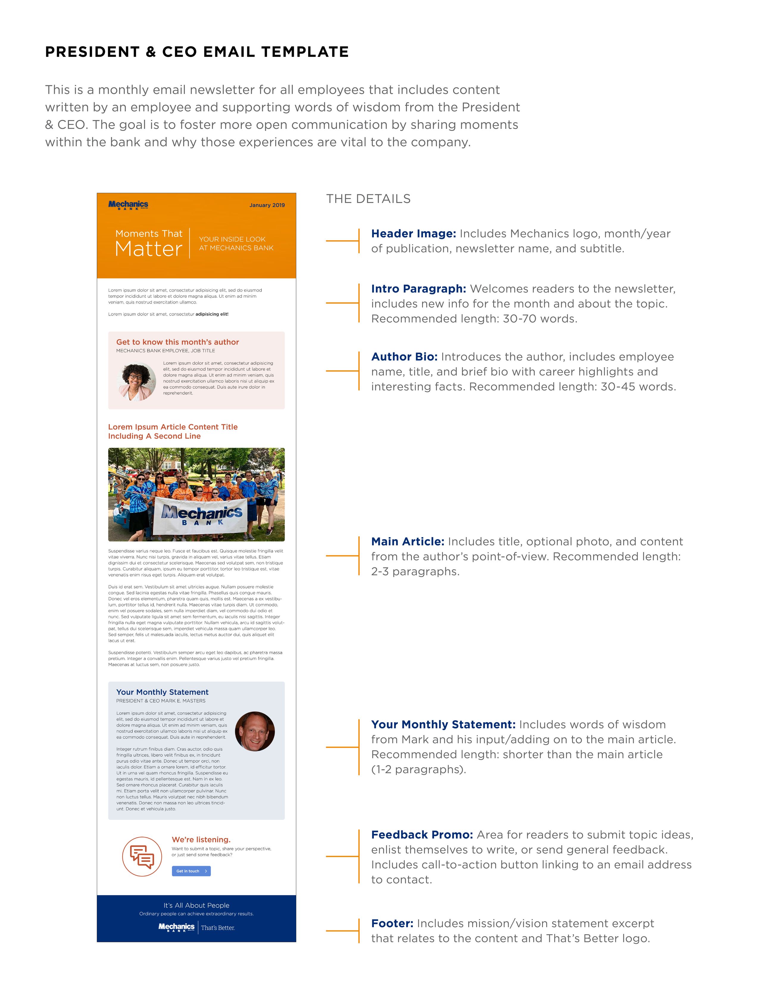
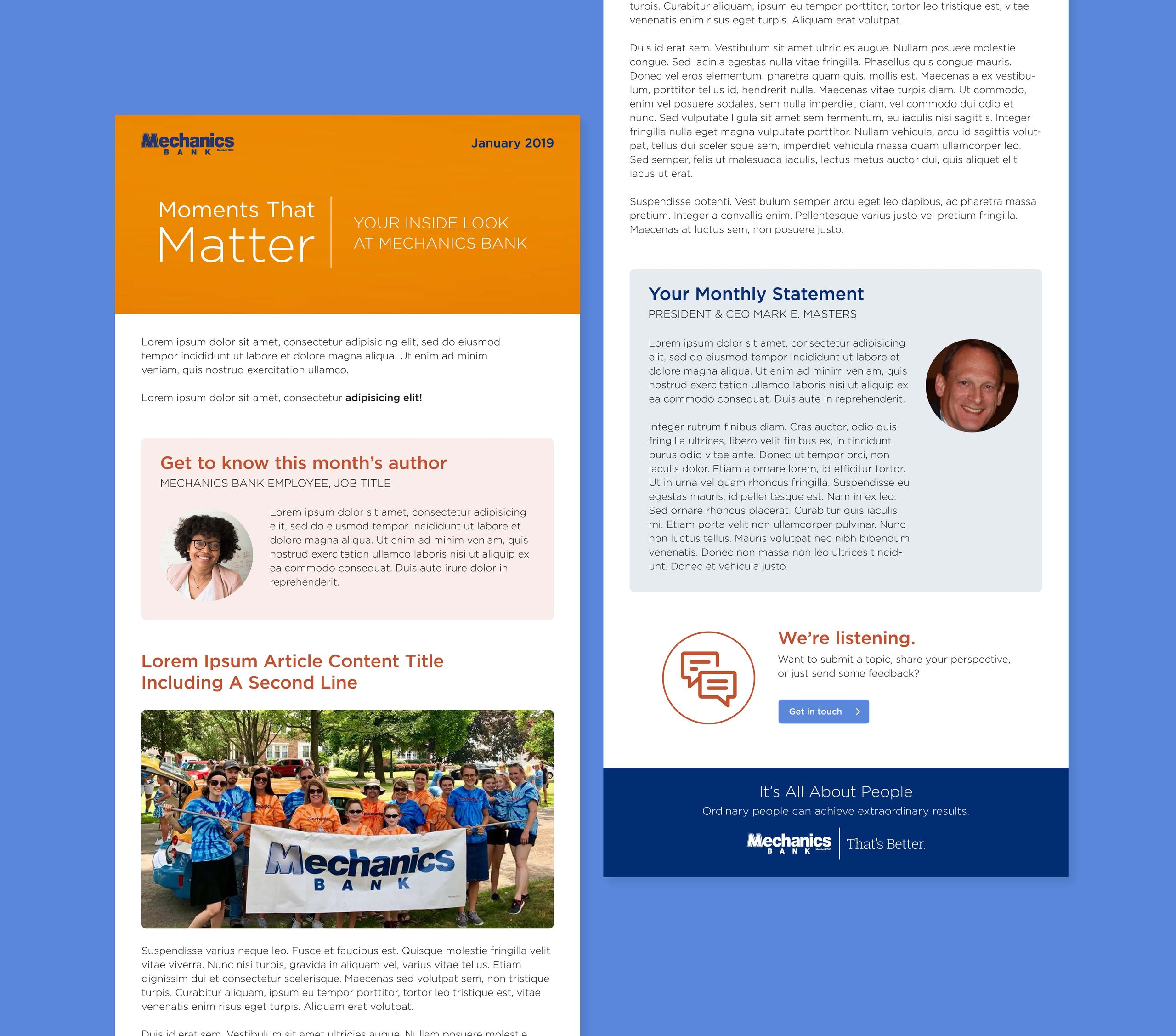
Sharing moments that matter. I concepted and designed an internal email newsletter to accompany the site launch. We envisioned a monthly email newsletter for all employees that includes content written by an employee and supporting words of wisdom from the President & CEO. The goal is to foster more open communication by sharing moments within the bank and why those experiences are vital to the company.

