Cutting Design Hours by 40% Through Figma Efficiencies. Figma Boilerplate: Design in Days, Not Weeks.
Our Figma boilerplate serves as the cornerstone of our design mockup phase, enabling our team to translate complex requirements into interactive, branded experiences. However, as our product scaled, the lack of built-in patterns meant designers were constantly recreating the wheel, leading to significant bottlenecks and inconsistencies between our design files and production code.
This case study highlights my initiative to overhaul the boilerplate into a true, token-based design system. By integrating over 70 responsive component patterns and scoping 185 variables for 1:1 code parity, I transformed our workflow from a manual, repetitive process into a streamlined engine that empowers designers to deliver captivating mockups in days rather than weeks.
I established a true design system, and kept it fresh with regular maintenance.
My Roles
- Senior UX Engineer / Design System Lead
The Problem
Our design mockup phase was bottlenecked by a lack of reusable patterns, forcing designers to “reinvent the wheel” for basic layouts.
The Outcome
Reduced design hours by 40% and established a scalable, token-based system that bridges the gap between design and implementation.
Team
- Sr. Front-End Designer: Ted Boyer
- Sr. Content Strategist: Susan Sarratt
- Sr. Implementation Manager: Danette Ramirez
Work completed in 2023–2025 for Inkling
Figma Boilerplate
Challenge
Our team was bogged down by manual, repetitive work that slowed down customer time-to-launch.
Background. Our design mockup phase was a major bottleneck. Because our existing boilerplate lacked built-in patterns, designers were forced to recreate simple layouts from scratch for every new implementation. This “reinventing the wheel” slowed us down significantly and created inconsistencies between our design files and our production code.
The boilerplate also required tedious manual work to update the customer presentation pages (slides which outline the customer’s branding as it will appear in their template). For example, content mockups had to be copied and pasted into the slides every time a change was made.
Strategy & Evolution
Reducing implementation timelines through cutting-edge efficiencies.
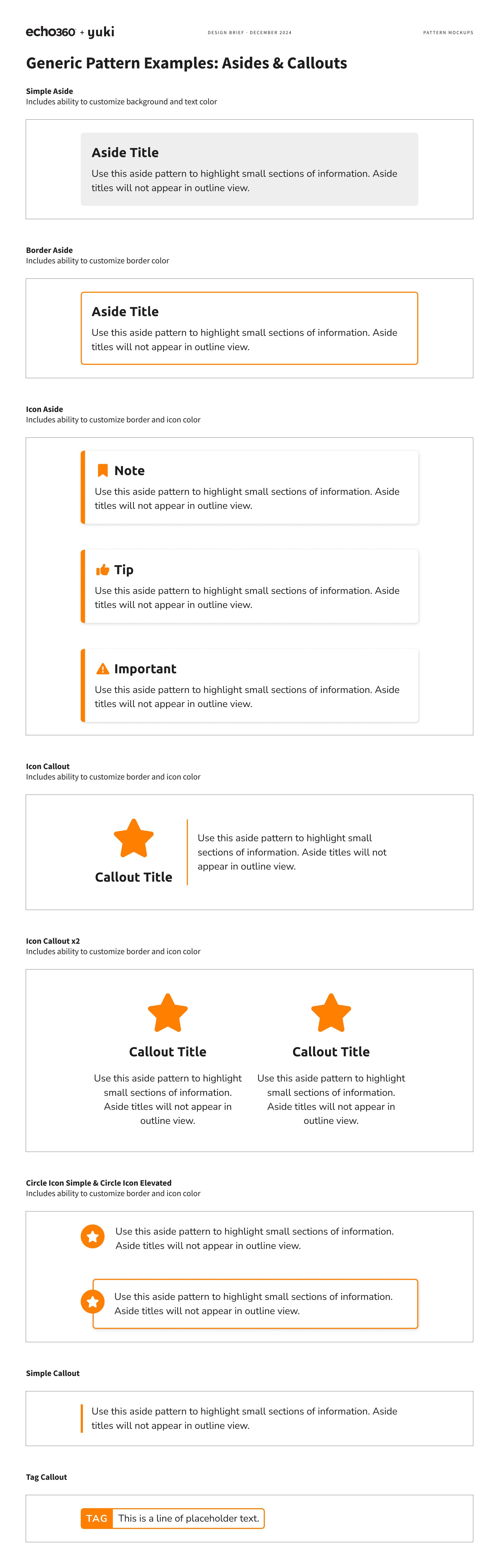
Ownership. To begin, I outlined requirements for our ideal state. With these must-haves in mind, I built three dozen components for content mockups, starting with the most pressing needs first. For example, Headers, Lists, and Asides are used commonly in the procedural content that we work with. Over a two-month period, my goal of having a working library of drag-and-drop components was coming to fruition.
I referenced these directly from the existing patterns in our codebase, so only the highest relevancy patterns were considered initially. I aimed to build the components in a way that reflected how they worked in HTML, to stay true to the grain of the web.
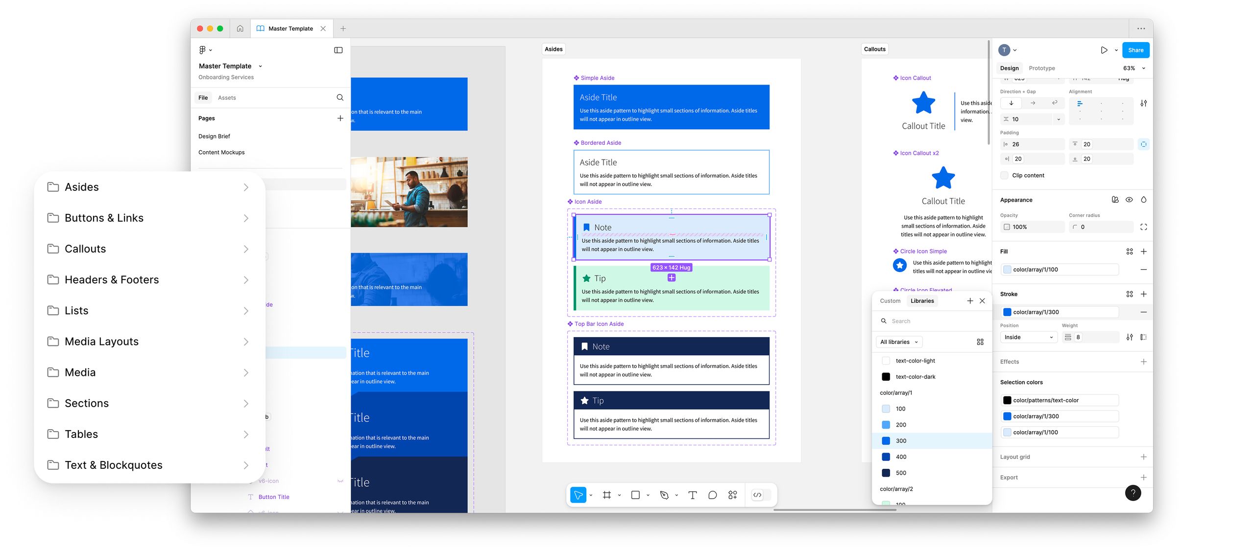
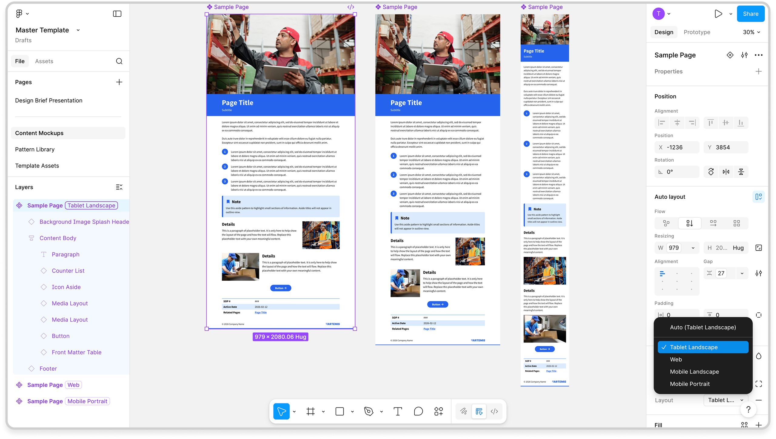
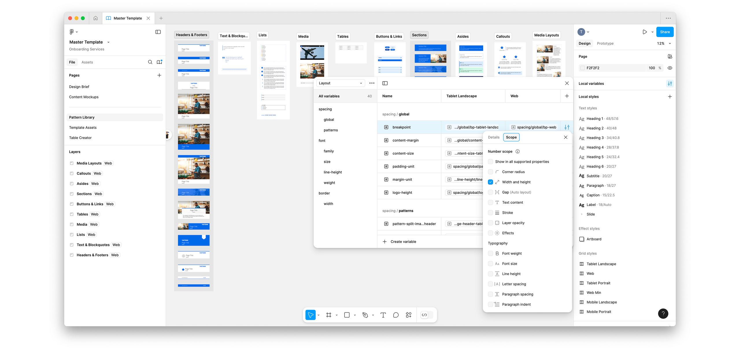
The magic of Variables. When Figma introduced Variables in summer 2023, it completely transformed my approach to this library. By mapping our codebase’s design tokens directly into our patterns, I built advanced components that automatically adapt to product breakpoints. Now, instead of manually rebuilding mockups for web, tablet, and mobile, designers can reflow complex layouts in just a few clicks—completely eliminating the need for tedious, manual rework.
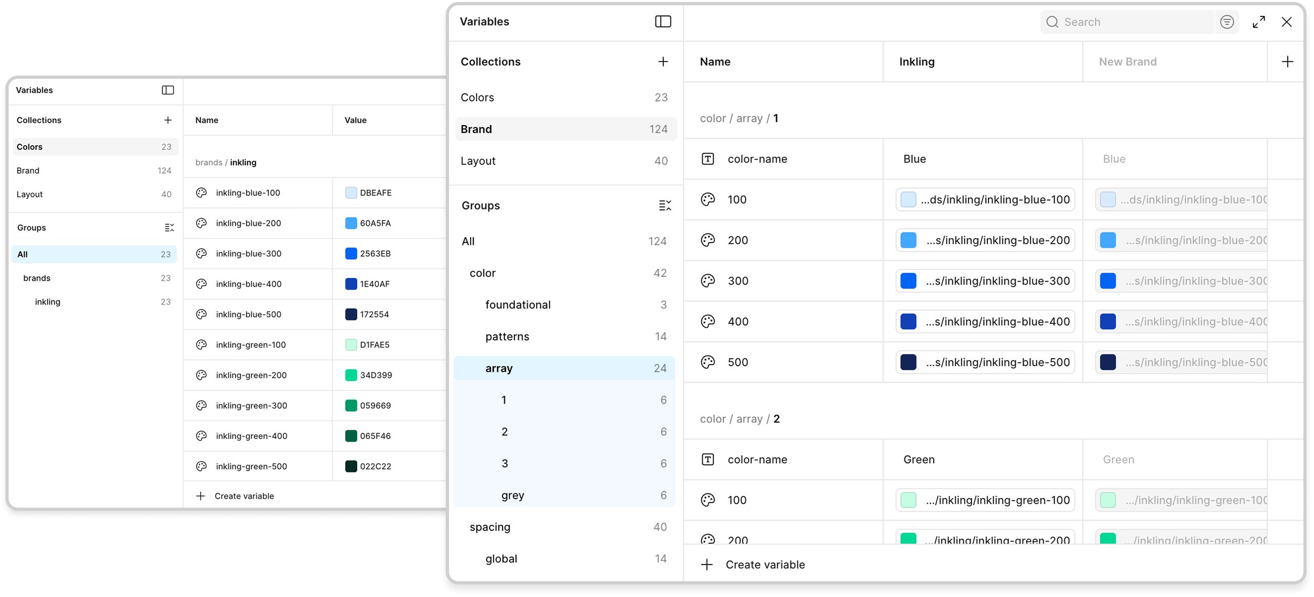
With spacing variables plugged in to each component, I used Modes to allow designers to quickly toggle between common breakpoints. This saves hours of effort and re-work, because each version is now identical under the hood.
Evolving the foundation. As the system evolved, I continued refining our workflow:
- Automated manual tasks using Figma plugins like Table Creator and Contrast.
- Unified the look and feel of our customer-facing pages.
- Scoped all 185 variables to limit which properties they can be applied to, reducing guesswork for designers.
- Documented new processes in Confluence to ensure smooth team adoption.
Impact
Less manual rework, faster delivery, and a 40% reduction in design hours.
Results. This overhaul decreased our design hours by 40%. What used to take weeks of effort can now be accomplished in days, allowing our team to focus on high-level strategy rather than pixel-pushing.
Not only did this improve our customer onboarding experiences, but it allowed me to automate myself out of tedious work so I could focus on more high-impact initiatives.

Case Study
Yuki
Helping a pioneer in accounting software support everyone with a learning need.
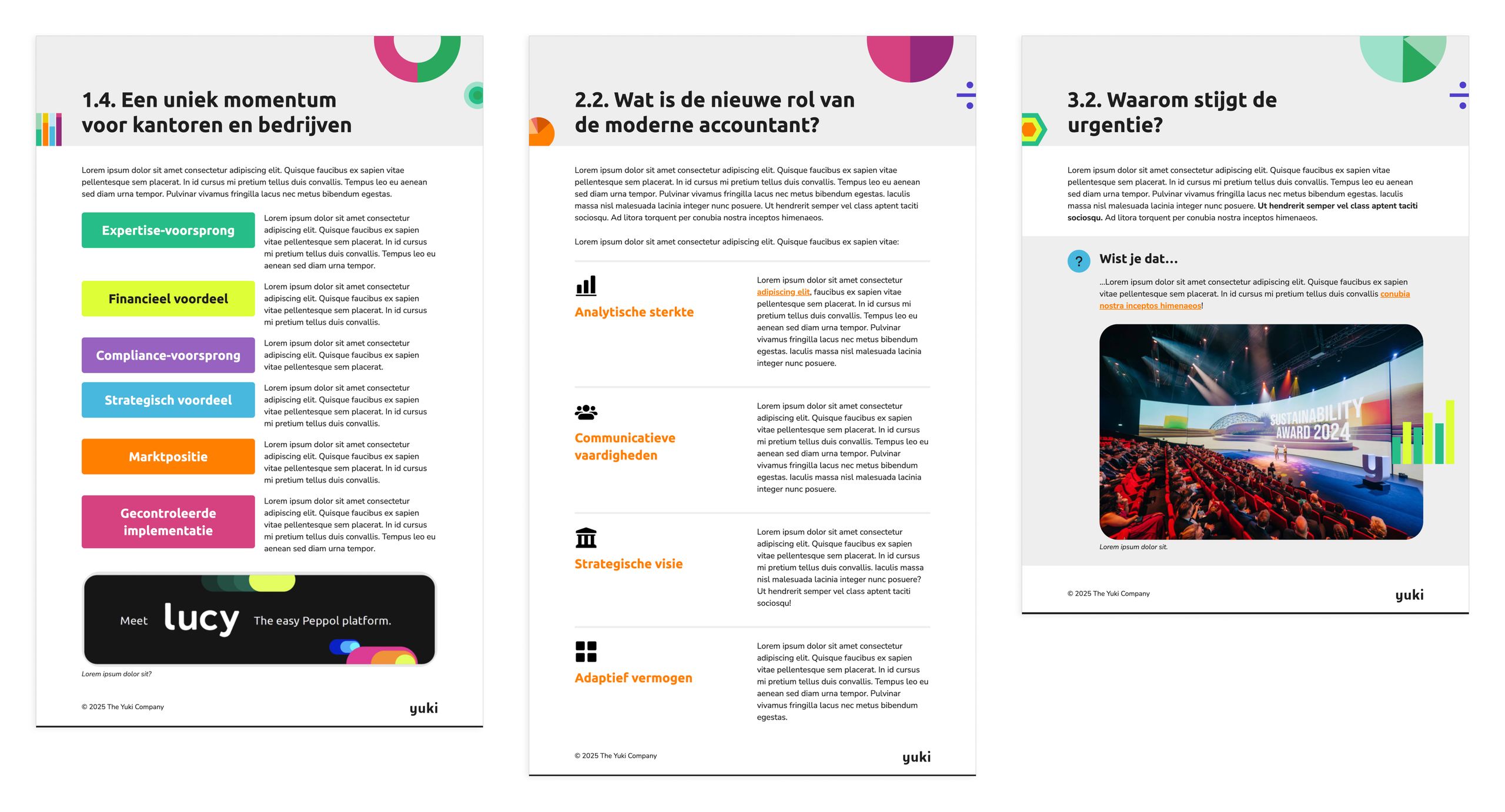
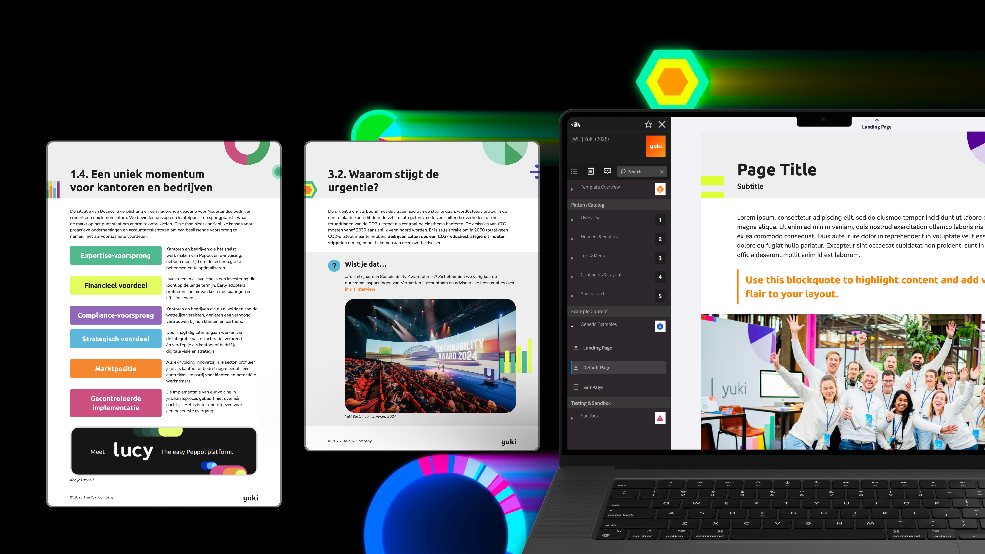
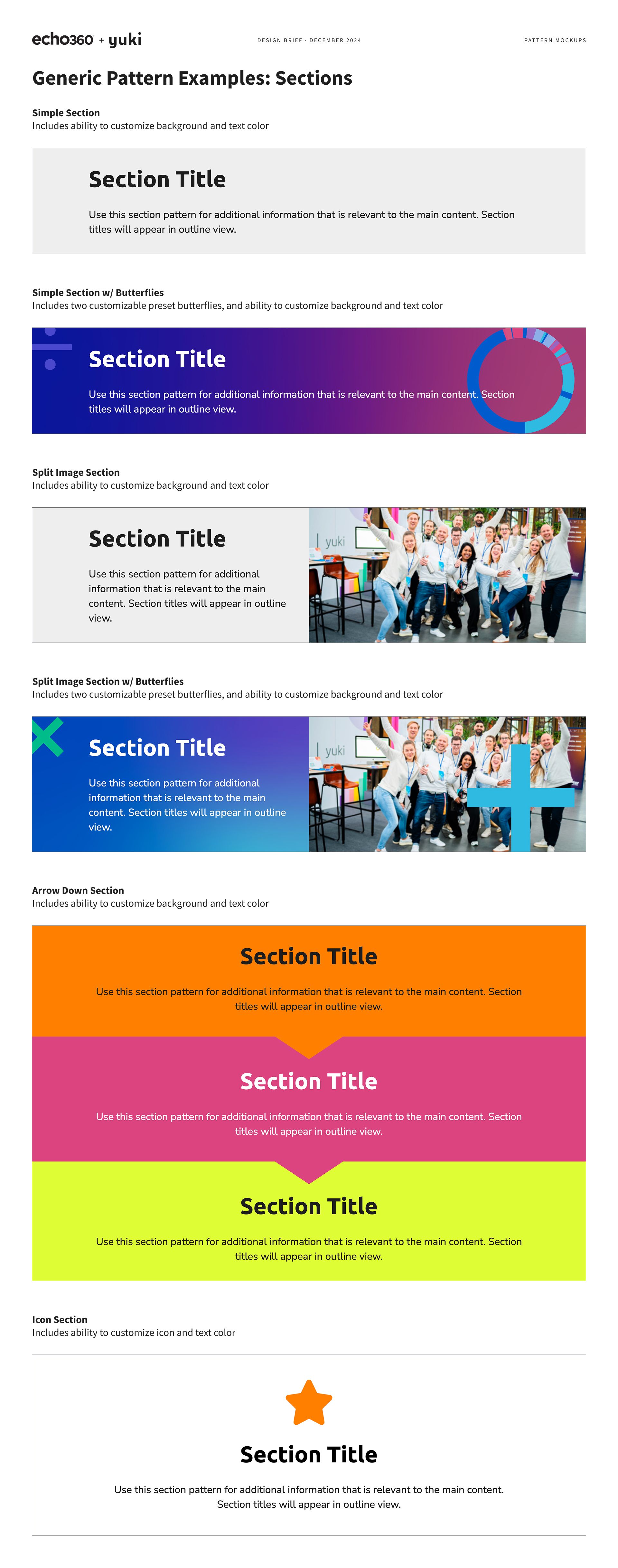
Background. One exemplary case study of my work in action is for Yuki, a recent technology customer. Yuki is a leader in accounting software based in Europe. They purchased us to support everyone with a learning need and increase course start and completion rates. In our discovery phase, it was clear that their branding was something they were passionate about, so ensuring consistent use of the Yuki brand would help users feel comfortable with the content.
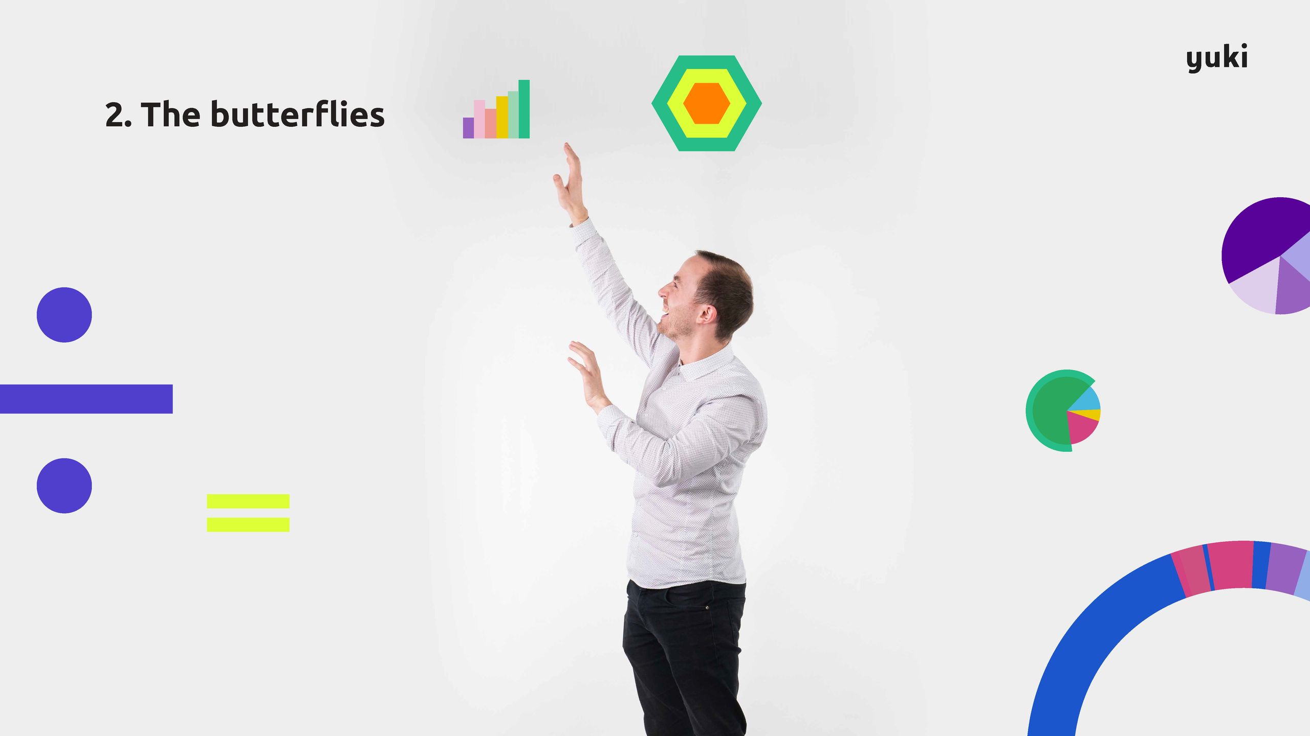
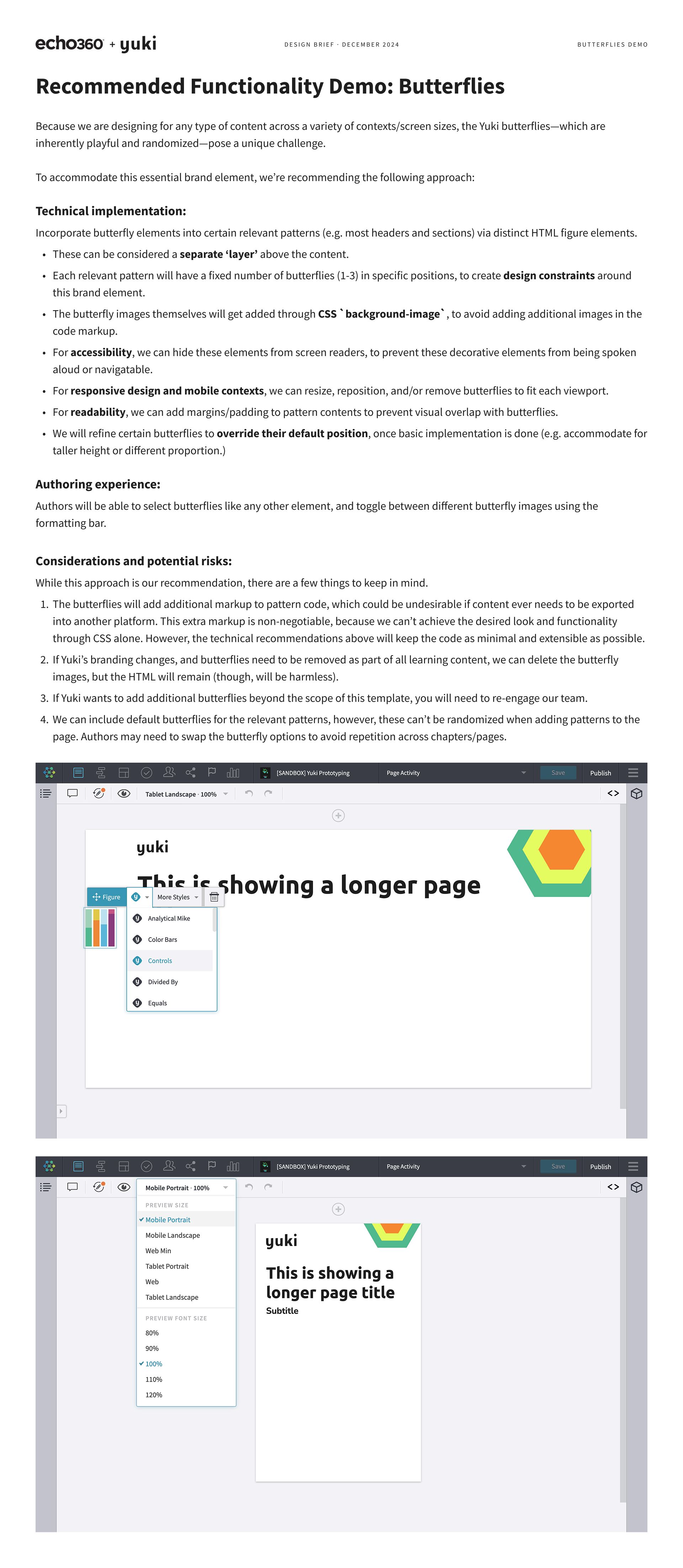
Challenge. As we approached mockups, one element—the Yuki “butterflies”—posed a unique challenge. Inspired by financial data, these butterflies are a set of abstract graphic objects that are inherently playful and randomized. They are frequently used within all materials to attract interest and make the dense, technical subject matter more light and fun.
Process. Randomization is not easy to do within web content or Inkdocs, which build on core web technologies. However, I created a development proposal to accommodate this essential brand element.
I outlined a new, never-done-before approach, covering how we would incorporate these elements into Habitat patterns as a separate, customizable layer, factored in considerations for accessibility, responsive design, and CSS, and communicated and mitigated potential risks with this plan.
Finally, I shared all of the above in a clear, approachable way, which helped the Yuki team remain confident in signing off on the designs.
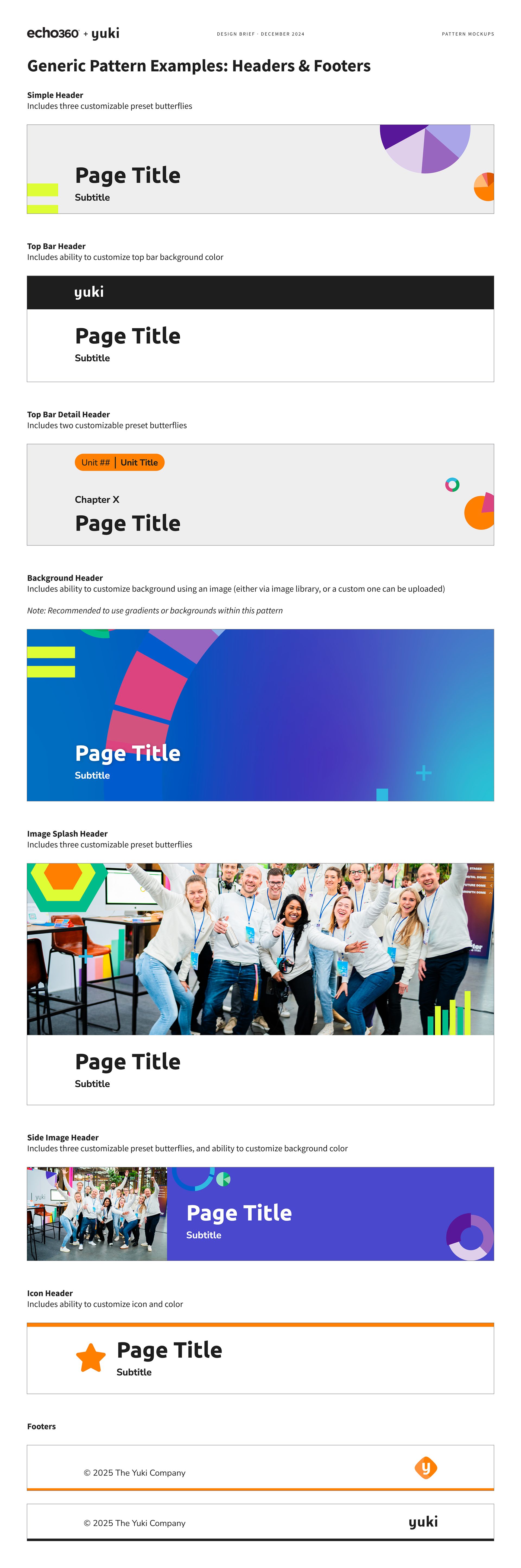
Results. The customer has been thrilled with this work—praising our team for adhering perfectly to their brand and staying adept to their questions and requests as they get up to speed.
On top of completing mockups in just 20 hours (about half of the typical time before I established our Figma boilerplate in 2023), I also completed development well ahead of their end-of-year deadline. As a result of the success of Yuki’s template, we even built a second template for their Lucy product in just 10 hours, using my foundation to extend upon.