Inkling Templates. Driving quality and innovation for digital learning authoring tools.
As the Senior Front-End Designer, I play a pivotal role in our customers’ success. I work with customers early in their Inkling relationship to scope projects, listen to & address use cases, design & code responsive, brand-aligned templates, and train teams on advanced software use and techniques.
My recent work has evolved beyond customer implementations—I’ve spearheaded innovations for our product itself. Since joining Inkling in 2021, I’ve made this product area a focus of my work, to improve experiences for authoring teams/end users/teammates, drive quality and innovation for our tools, and reduce technical debt that has burdened us in the past.
My Roles
- Front-end design
- Research & development
- Product implementation
- Product strategy
- Documentation
Team
- Sr. Front-End Designer: Ted Boyer
- Sr. Content Strategist: Susan Sarratt
- Sr. Implementation Manager: Danette Ramirez
Work completed in 2021–2024 for Inkling
Inkling Templates
Customer implementations
Empowering Inkling’s B2B customers by leading the front-end design process.
- 25 templates
- built from Discovery to Go Live, enabling customers to set up large-scale content libraries (on a scale of hundreds to thousands of digital books called Inkdocs)
- Team of three
- including myself, a content strategist, and implementation manager
- 2 million
- frontline workers, students, and corporate learners served
Background. Founded in 2009 by a group of former Apple employees, Inkling has transformed the process of building device-responsive and interactive content. Many leading brands, including McDonald’s, Whole Foods, McGraw Hill, and ServiceNow, rely on Inkling as their industry training solution. Customers and users appreciate our product for its unique design, performance, and integrated capabilities.
Working directly with our customers is a favorite part of my job, and it’s where I spend most of my time. Inkling’s B2B customers vary in size and industry, and each implementation’s content use cases are unique.

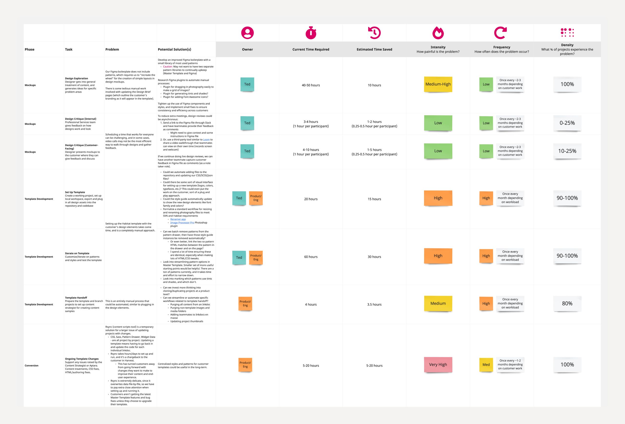
Kickoff. Sales aligns us on context & critical items, then we meet with the customer team and demo our platform end-to-end.
Discovery. We thoroughly assess the customer’s branding, content, and materials, I partner with our Content Strategist to share notes, and we clarify questions & assumptions.
Design Mockups. I build mockups to iterate and align on a design vision with the customer. I explore proposed treatments for content and patterns and generate ideas for focus areas. Mockups are then refined, presented, and polished based on feedback.
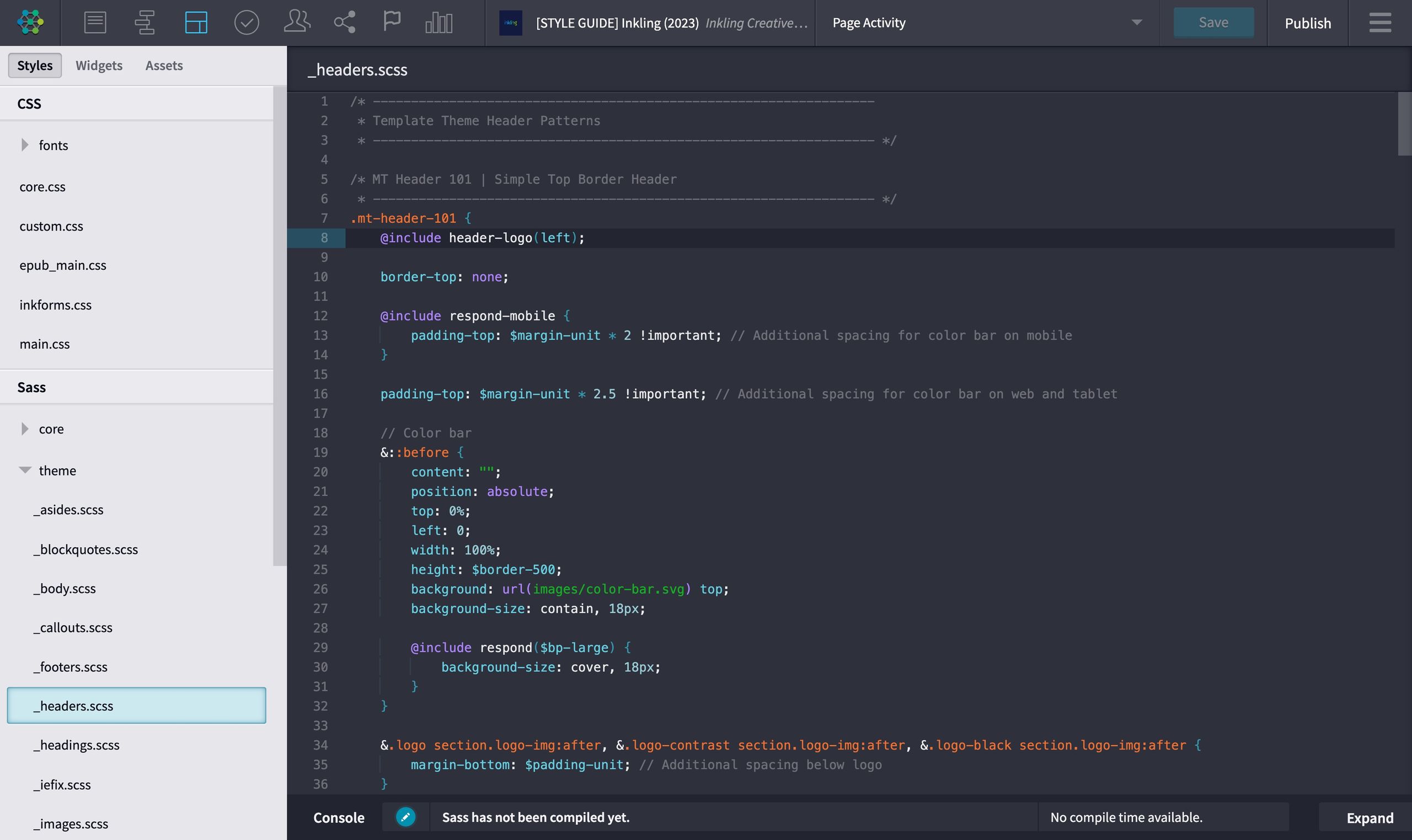
Template Development. Our codebase consists of HTML, Sass, CSS, various media, and other bits of software. I set up the template, customize default patterns based on our use case-aligned mockups, and test my work for quality, robustness, and authoring experience (AX) edge cases. The template gets handed off to the Content Strategist so they can collaborate with me on creating content samples.
Conversion. We take representative pages from the customer’s source content to test and preview the conversion rules at scale. We ship the customer’s source content to our partner, who brings all content into the new template for review/approval.
Case Study
Yuki
Helping a pioneer in accounting software support everyone with a learning need.
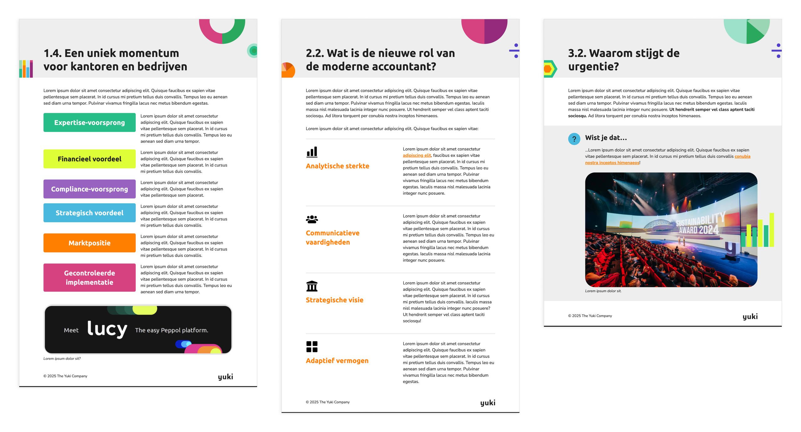
Background. One exemplary case study of my work in action is for Yuki, a recent technology customer. Yuki is a leader in accounting software based in Europe. They purchased us to support everyone with a learning need and increase course start and completion rates. In our discovery phase, it was clear that their branding was something they were passionate about, so ensuring consistent use of the Yuki brand would help users feel comfortable with the content.
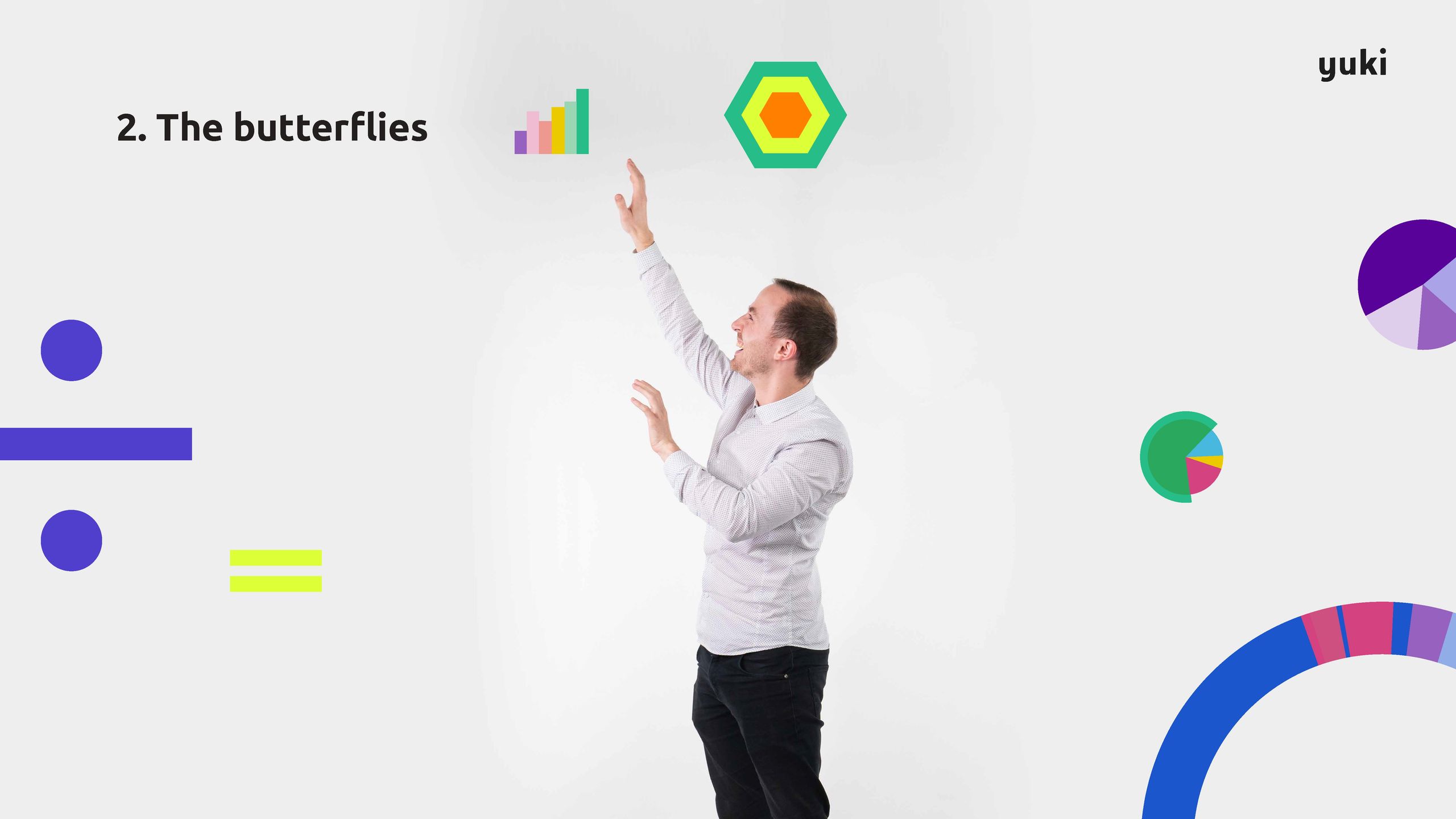
Challenge. As we approached mockups, one element—the Yuki “butterflies”—posed a unique challenge. Inspired by financial data, these butterflies are a set of abstract graphic objects that are inherently playful and randomized. They are frequently used within all materials to attract interest and make the dense, technical subject matter more light and fun.
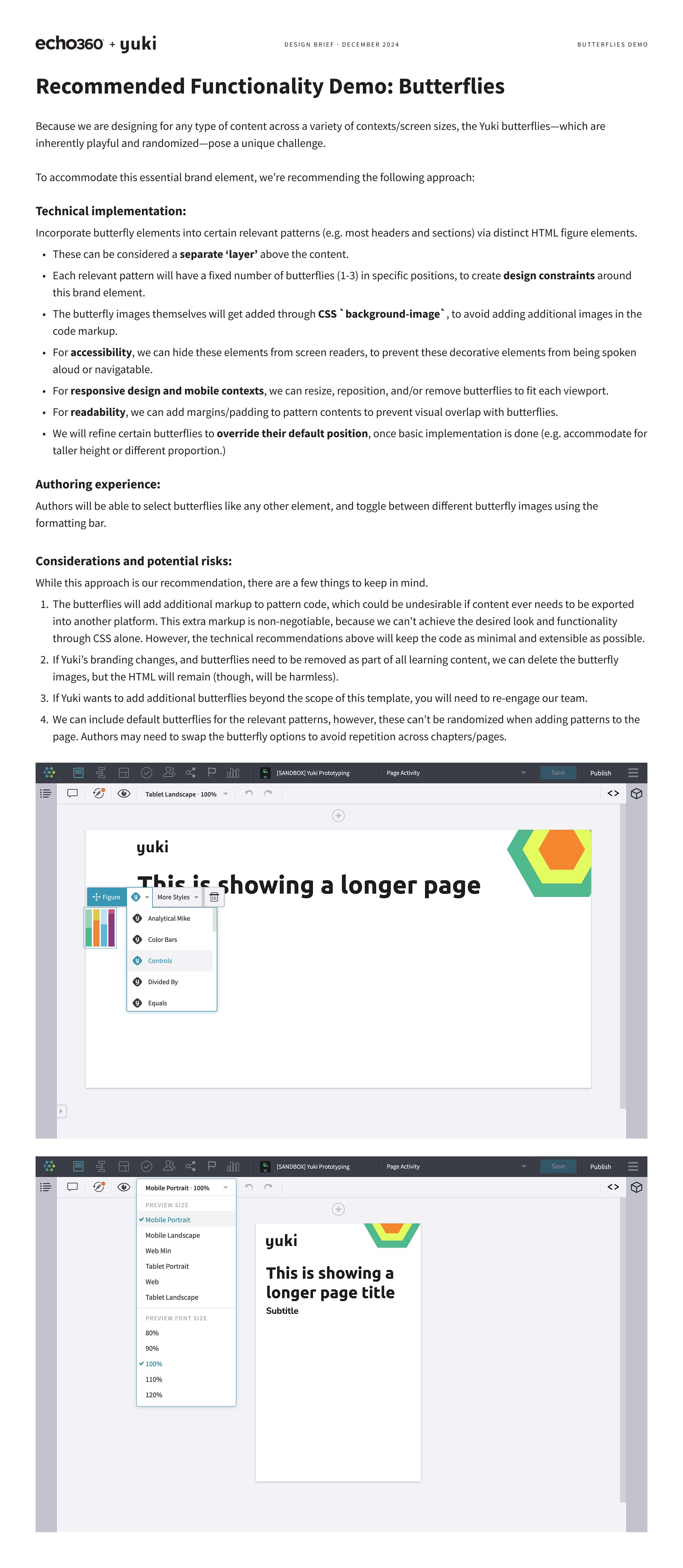
Process. Randomization is not easy to do within web content or Inkdocs, which build on core web technologies. However, I created a development proposal to accommodate this essential brand element.
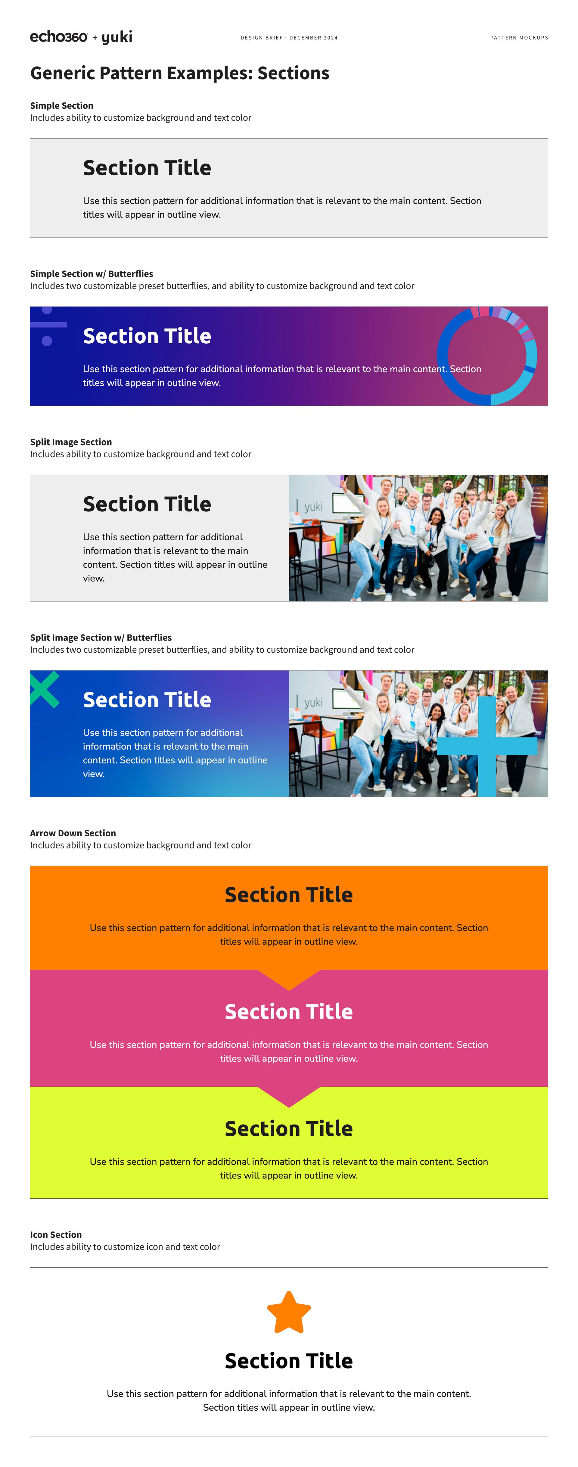
I outlined a new, never-done-before approach, covering how we would incorporate these elements into Habitat patterns as a separate, customizable layer, factored in considerations for accessibility, responsive design, and CSS, and communicated and mitigated potential risks with this plan.
Finally, I shared all of the above in a clear, approachable way, which helped the Yuki team remain confident in signing off on the designs.
Results. The customer has been thrilled with this work—praising our team for adhering perfectly to their brand and staying adept to their questions and requests as they get up to speed.
On top of completing mockups in just 20 hours (about half of the typical time before I established our Figma boilerplate in 2023), I also completed development well ahead of their end-of-year deadline. As a result of the success of Yuki’s template, we even built a second template for their Lucy product in just 10 hours, using my foundation to extend upon.
Project
Inkternal template
Helping Inkblots and leadership make the most out of our products.
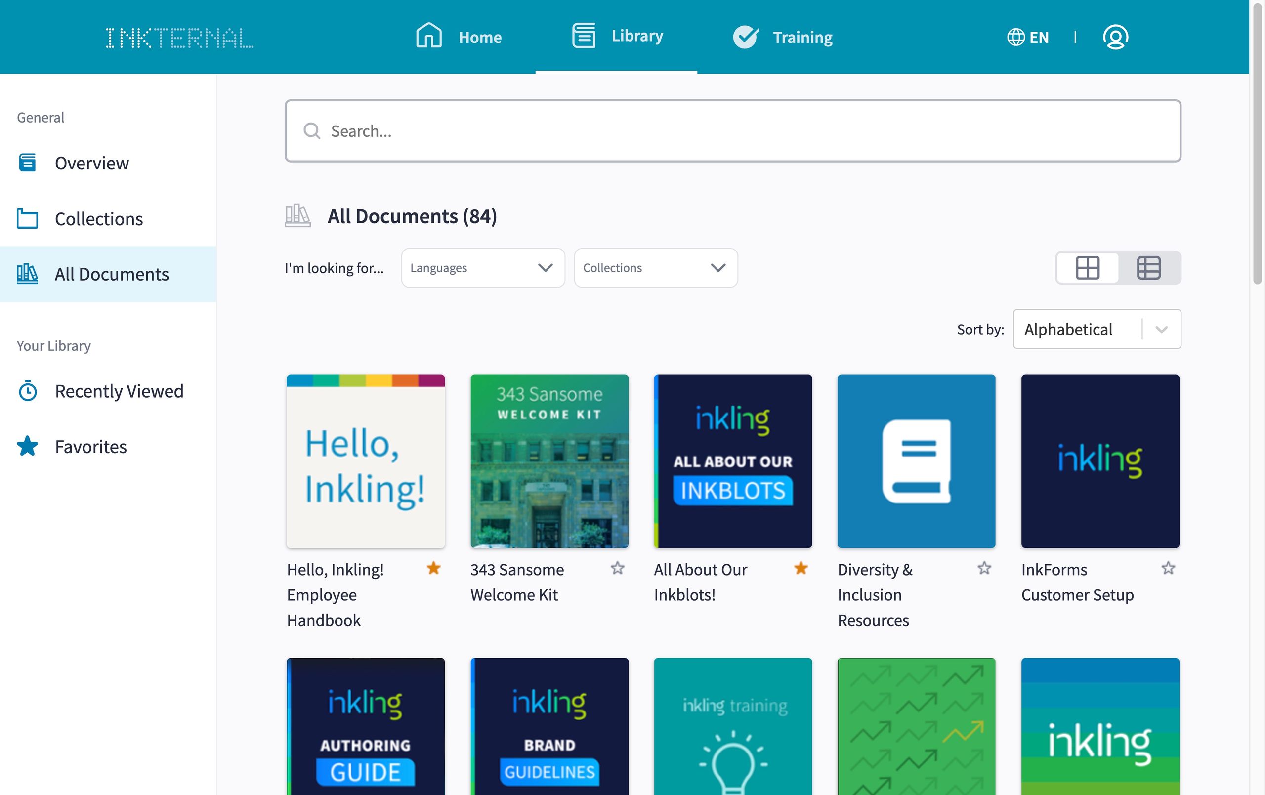
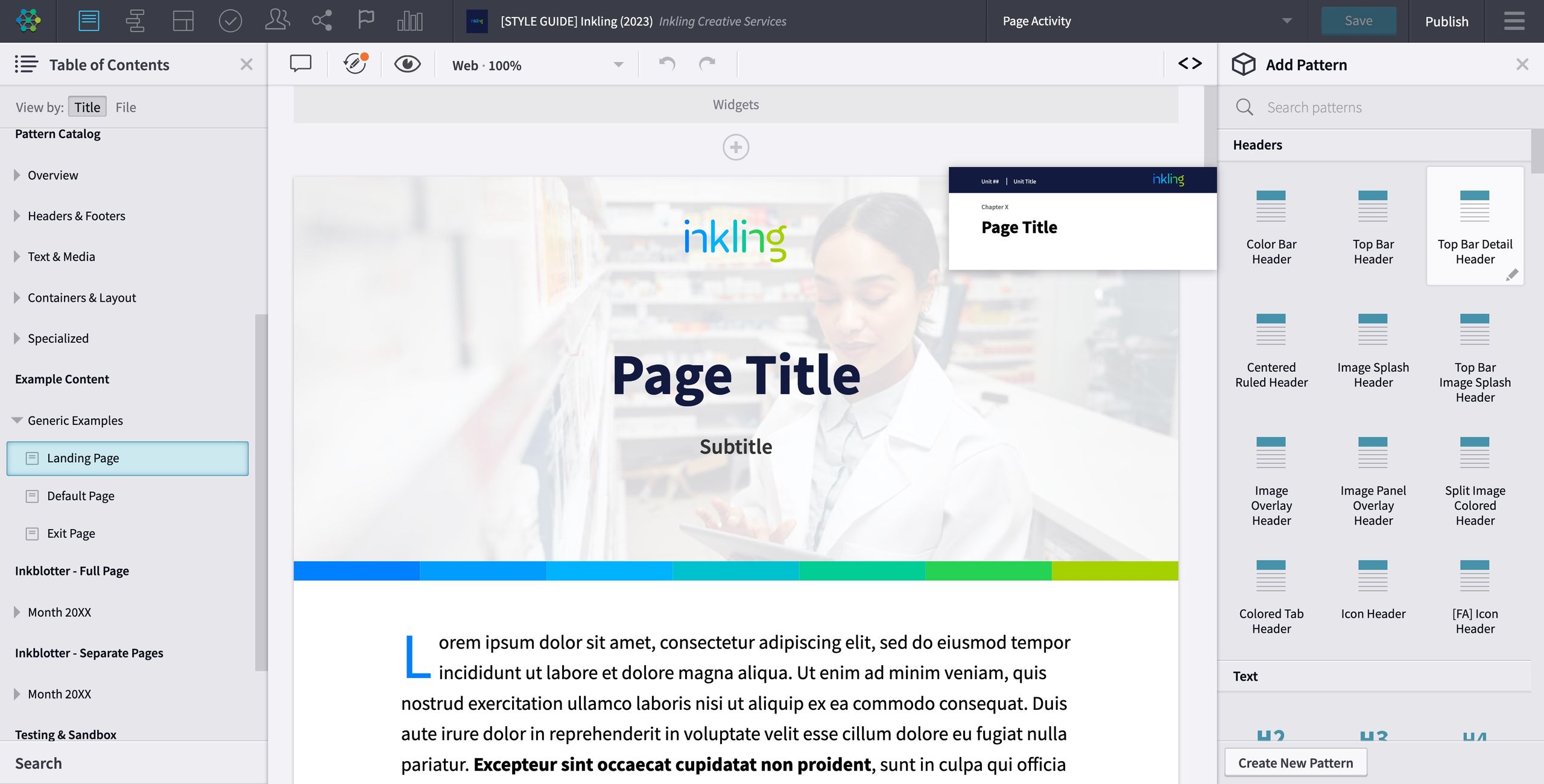
Background. Before this initiative, the authoring templates for internal use were ten years old and sorely outdated. Inkblots were missing out on the latest functionality we provide customers, a more extensive and comprehensive set of patterns (content building blocks), and the ability to create engaging Inkdocs with the recently refreshed Inkling branding.
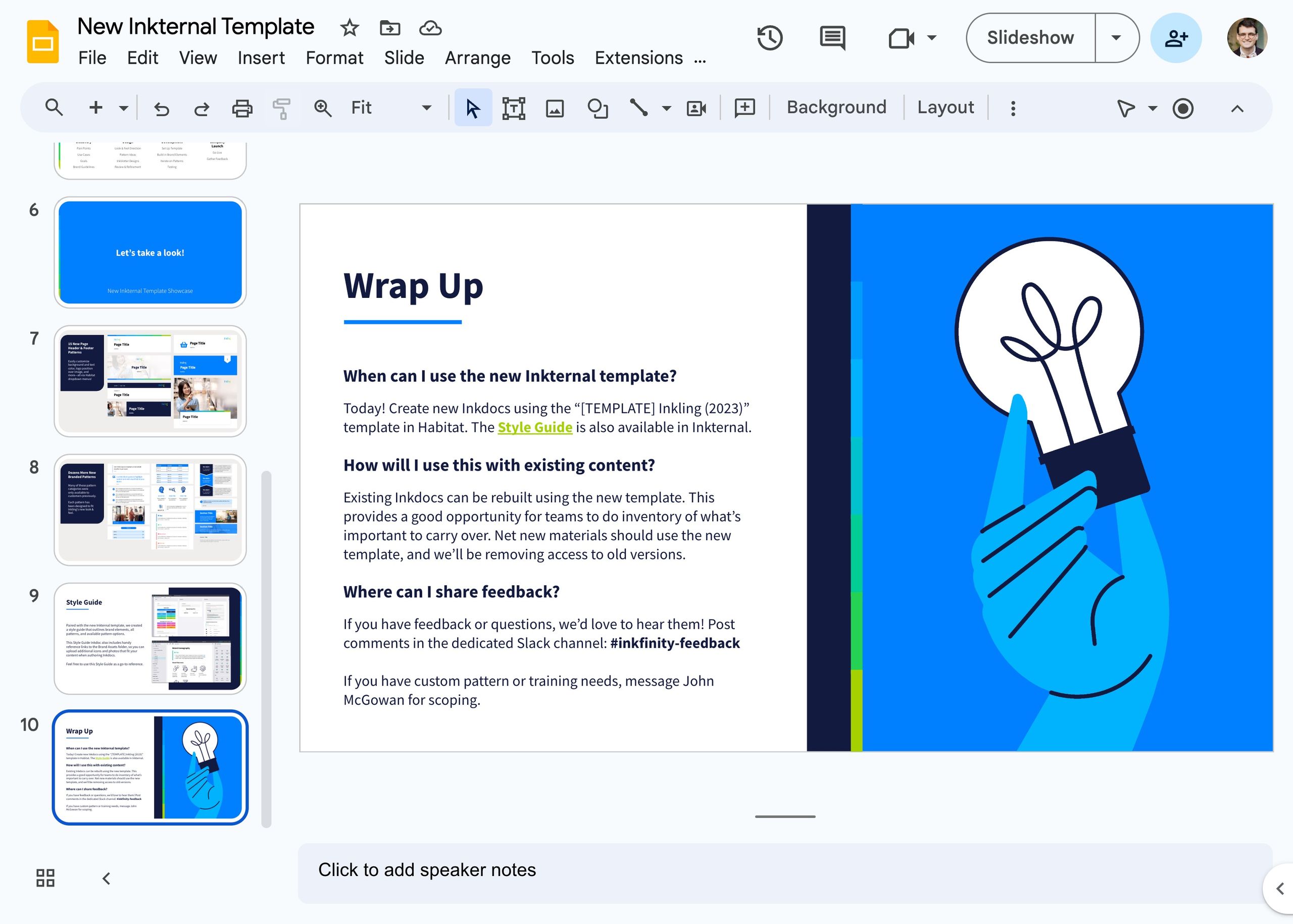
In 2023, I led a project to design and develop a new Inkternal template to provide Inkblots with these latest authoring tools. The team included members representing UX, Marketing, and HR as support.
Objectives. Our goals were to:
- Align the look & feel of the template to the new Inkling brand for consistency across materials
- Provide a practical and more thorough set of patterns for authors to design their content
- Include the latest functionality from Master Template, our boilerplate customer project
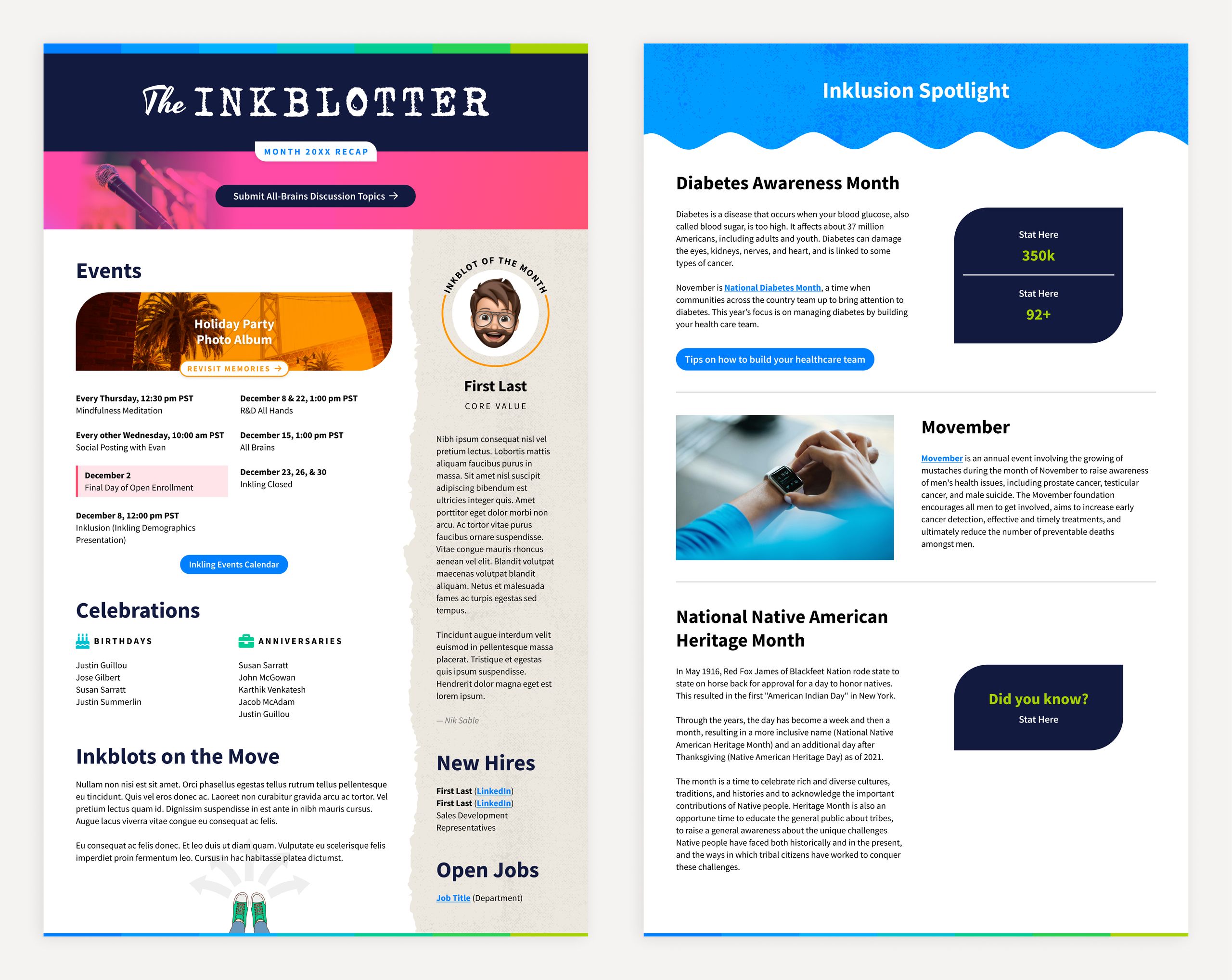
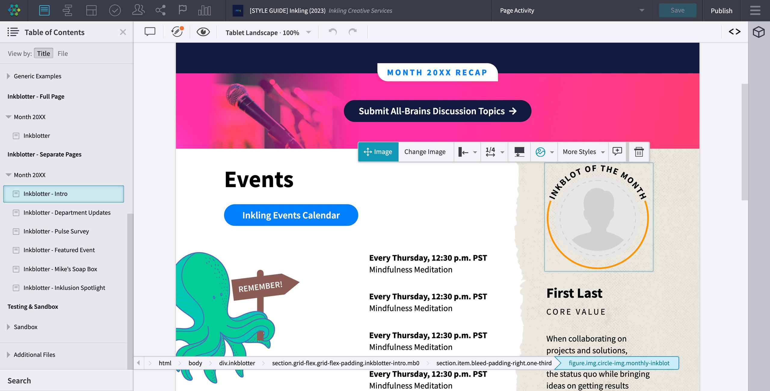
- Create patterns specific to the Inkblotter newsletter to allow the HR team to use and familiarize with our product
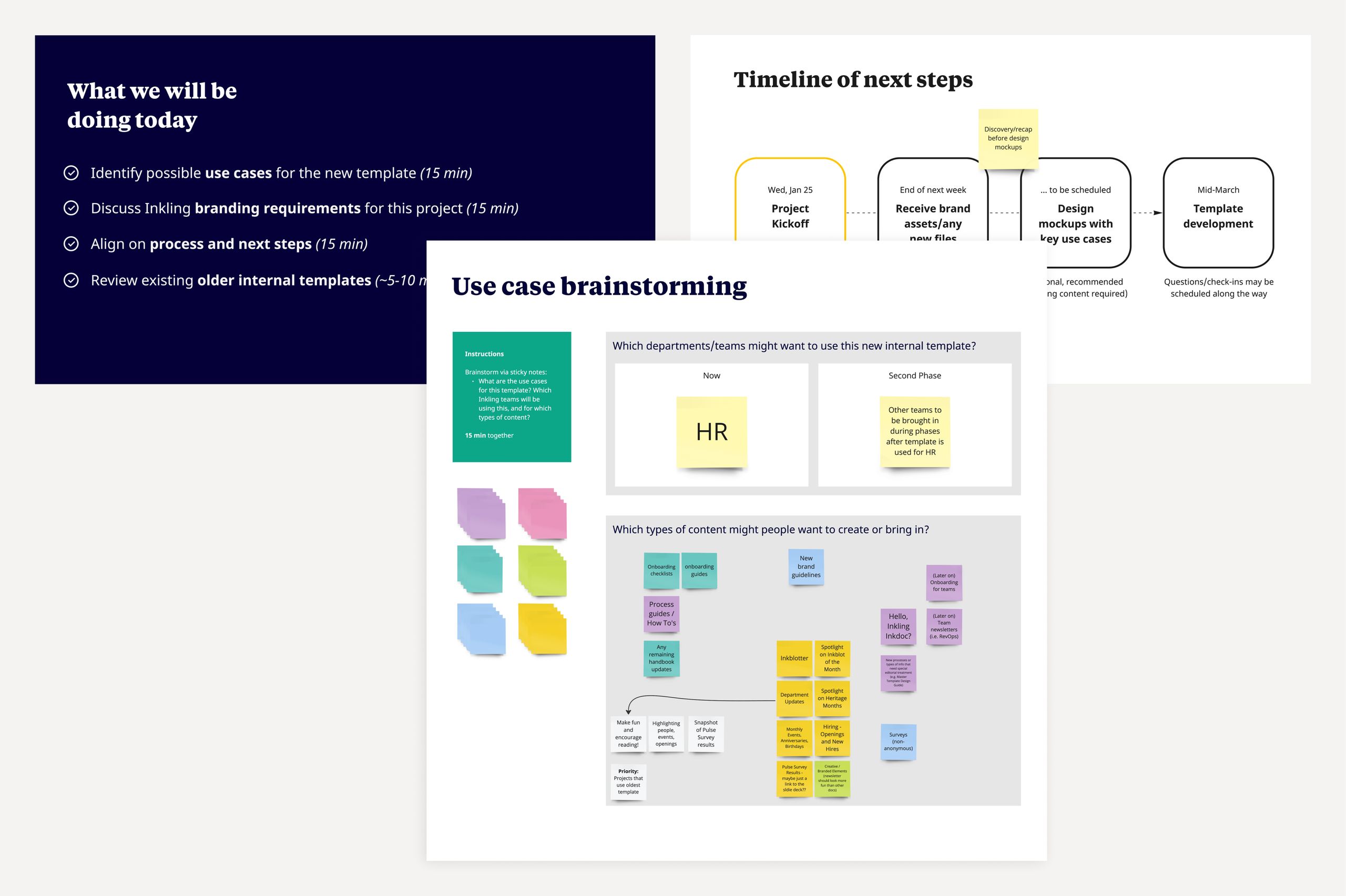
Process. Our process took about four months, alongside higher-priority customer work:
Discovery
- Pain points
- Use cases
- Goals
- Brand guidelines
Design
- Look & feel direction
- Pattern ideas
- Inkblotter designs
- Review & refinement
Development
- Set up template
- Build in brand elements
- Iterate on patterns
- QA testing
Go Live
- Company launch
- Gather feedback
Initiative
Figma boilerplate
Reducing implementation timelines through cutting-edge efficiencies.
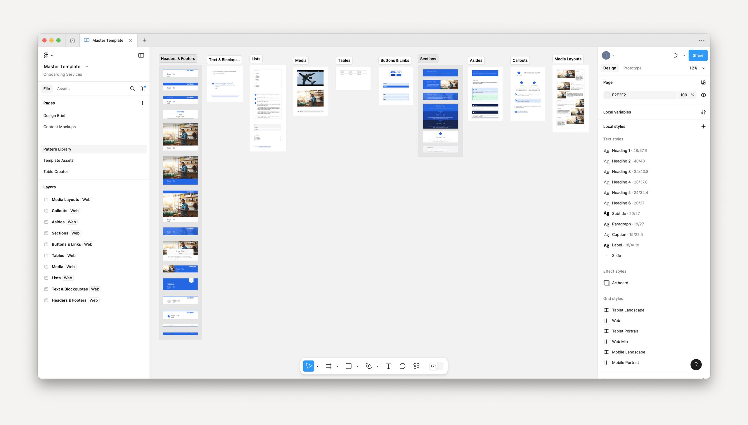
- 70+ patterns
- integrated as robust Figma components
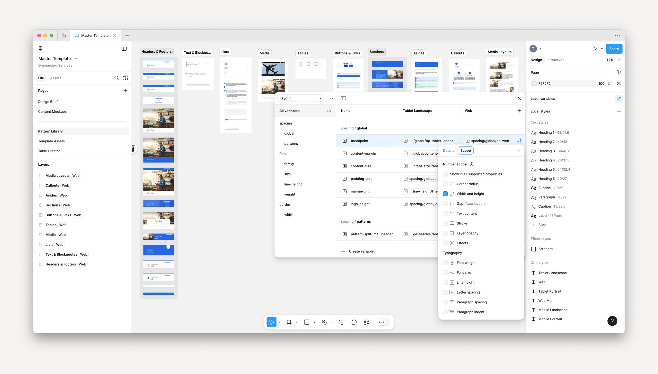
- 1:1 parity
- with Variables and the design tokens in our codebase
- 40%
- average decrease in hours for design mockups
Background. Our Figma boilerplate is a cornerstone for the design mockup phase of each implementation, but the previous version needed some critical features and efficiencies and needed to be kept up-to-date.
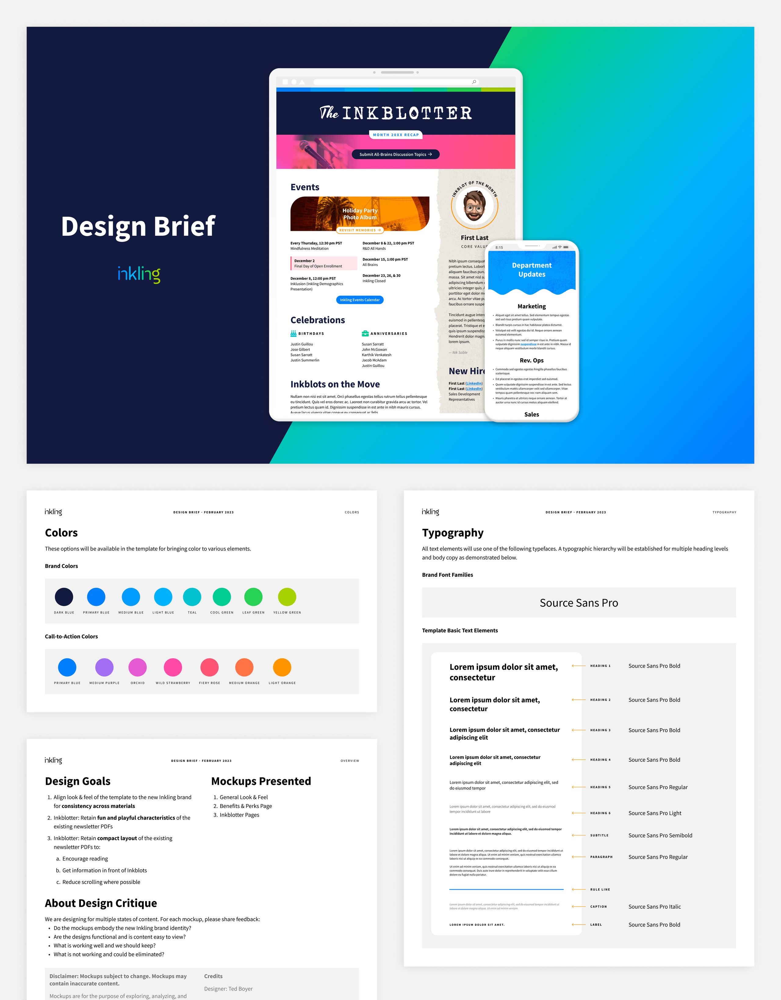
Because no patterns were built-in, we had to “recreate the wheel” to build simple layouts, which slowed us down significantly. The previous boilerplate also required tedious manual work to update the Design Brief pages (slides which outline the customer’s branding as it will appear in their template).
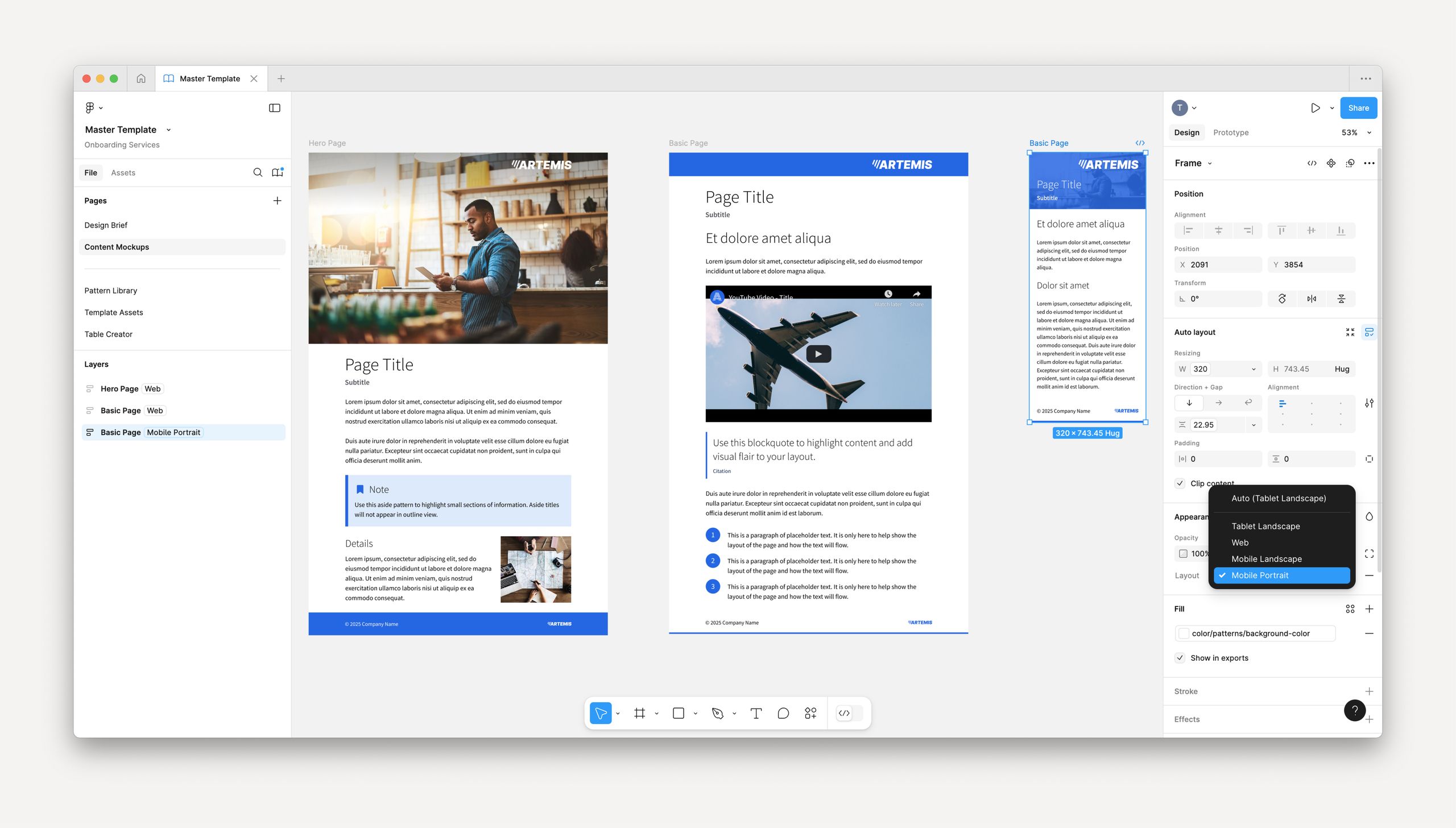
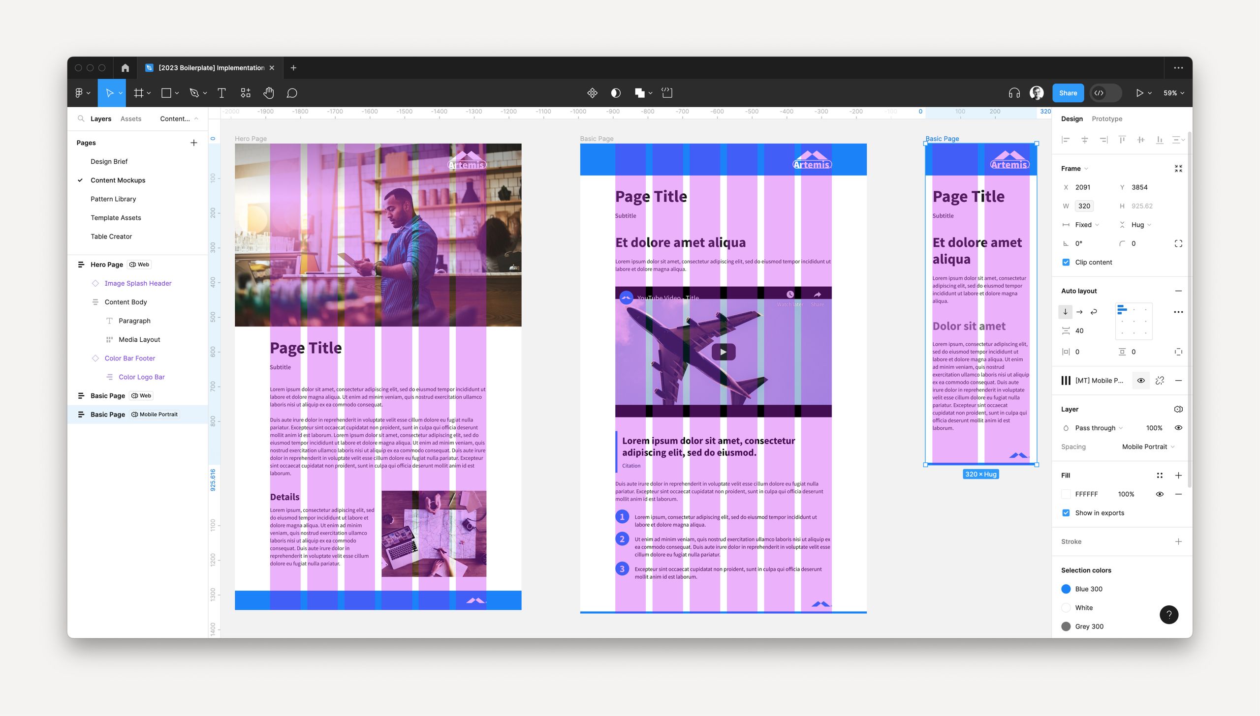
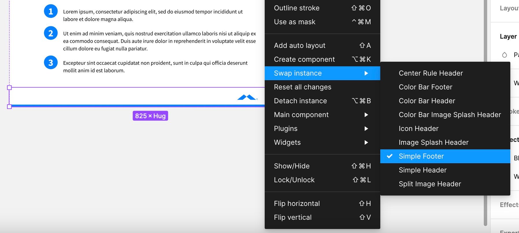
Initially, I built three dozen essential starting points for content mockups across top pattern categories. I also connected these components to Figma’s brand-new Variables feature to make them breakpoint-responsive. Instead of reworking mockups for Web, Tablet, Mobile, etc., each layout can reflow in just a few simple clicks, thanks to these advanced components.
Later in the process, I continued evolving our approach:
- Researched and implemented Figma plugins like Table Creator, Font Awesome, and Contrast to automate existing manual processes
- Redesigned customer-facing pages to reflect a more coherent, consistent look & feel
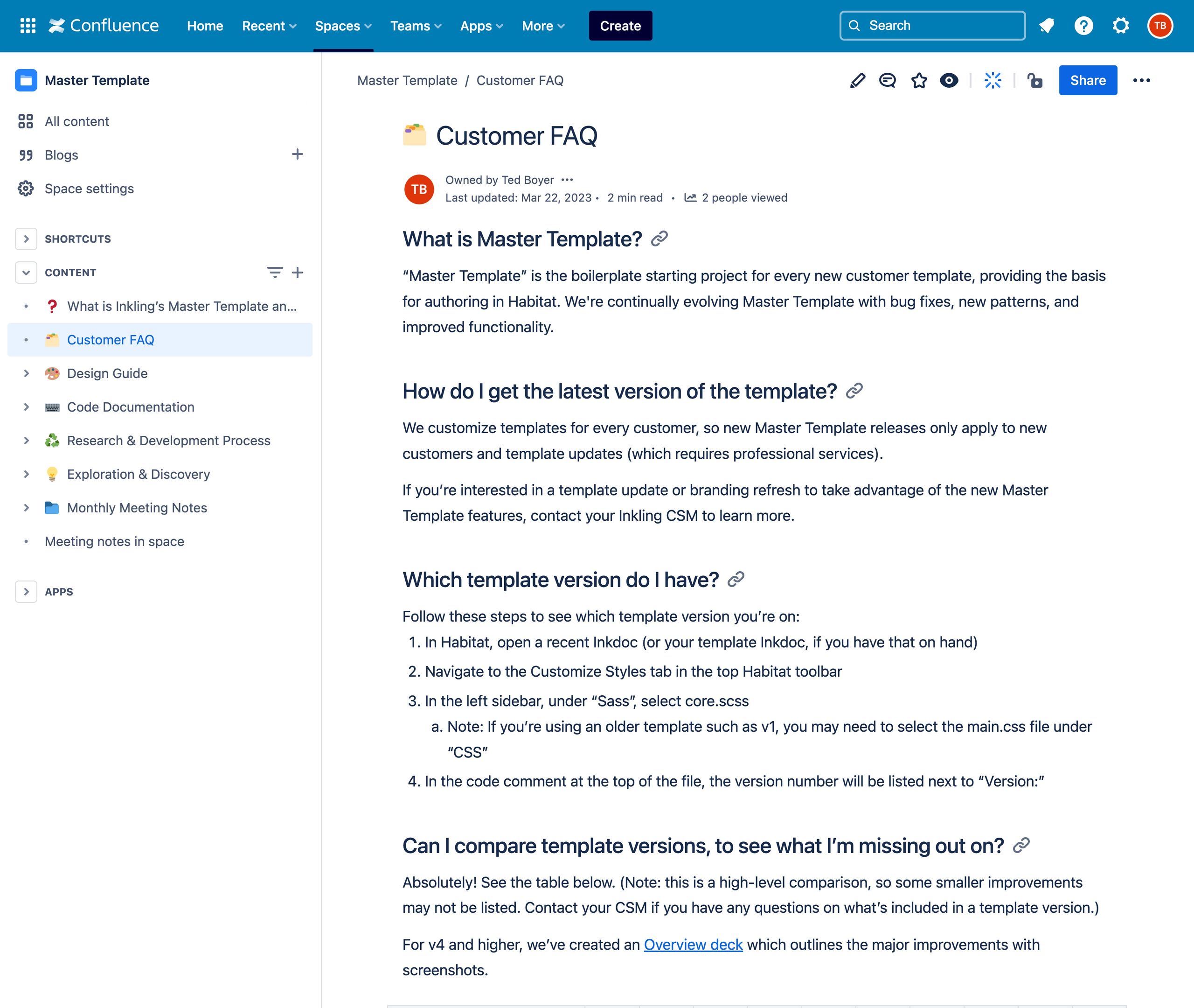
- Documented the latest updates in our Confluence space to ensure designers can understand processes moving forward
Thanks to this Figma boilerplate overhaul, we saved 18 hours on mockups for one of our largest customers (49 hrs scoped / 31 spent). I’m excited to see how this can further reduce implementation lengths.
Initiative
Master Template R&D
Establishing and driving a strategy and vision for our front-end authoring codebase.
- 6 new versions
- released and documented over 2 years, including substantial authoring/user interaction fixes and new features
- ~90%
- reduction of original backlog over 2 years (70+ issues completed), unlocking our ability to innovate
- 100+
- unused patterns identified and removed to speed up development
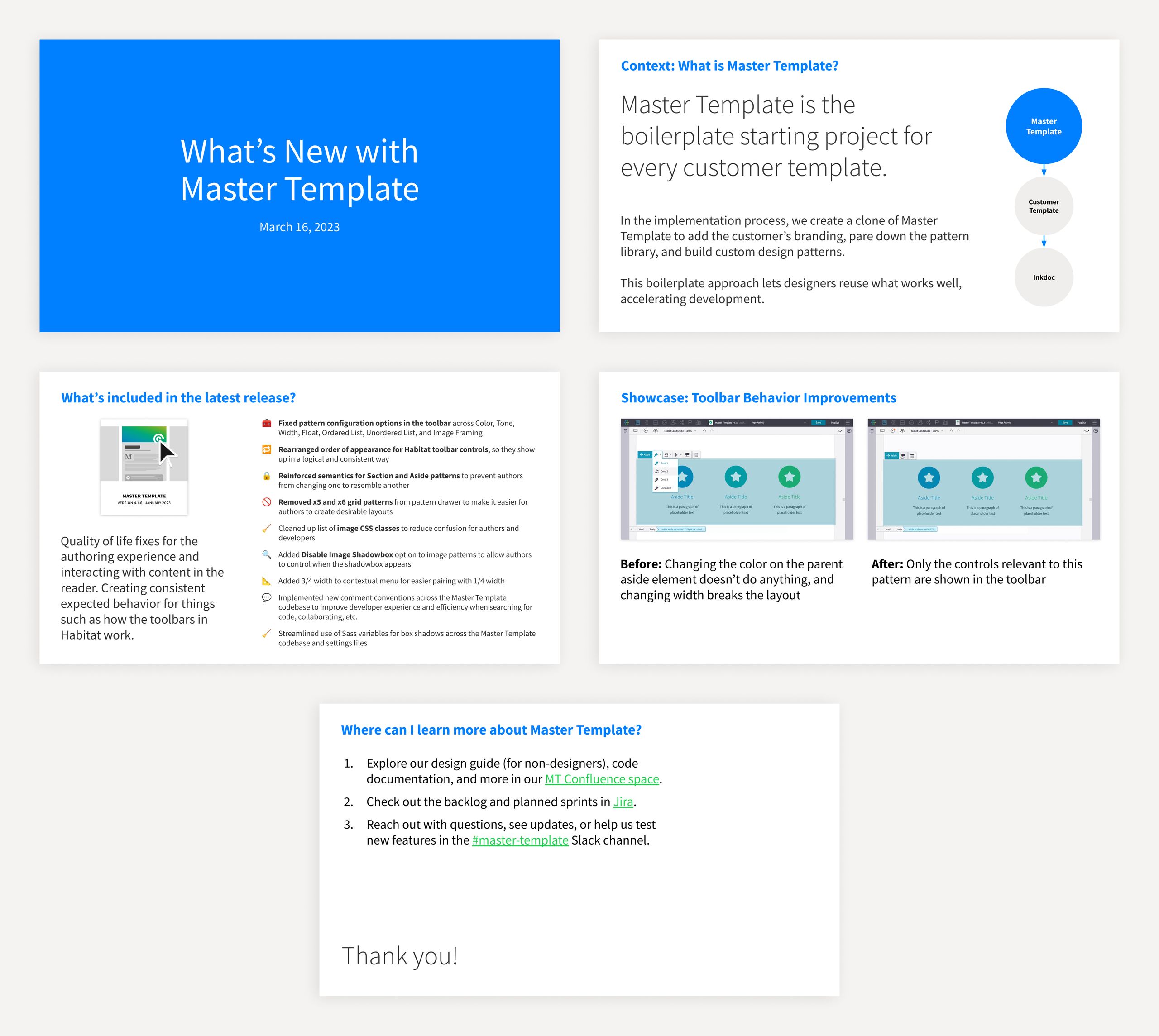
Background. Master Template is the boilerplate starter project for every customer template. In the implementation process, we create a copy to add the customer’s branding, pare down the pattern library, and build custom design patterns. This boilerplate approach lets designers reuse what works well, accelerating development.
Challenges. At the time, we faced several challenges:
- Many cooks in the kitchen: Multiple designers have touched the patterns and code along Inkling’s decade-long history, and there hasn’t been much structured documentation or principles for how we approach development.
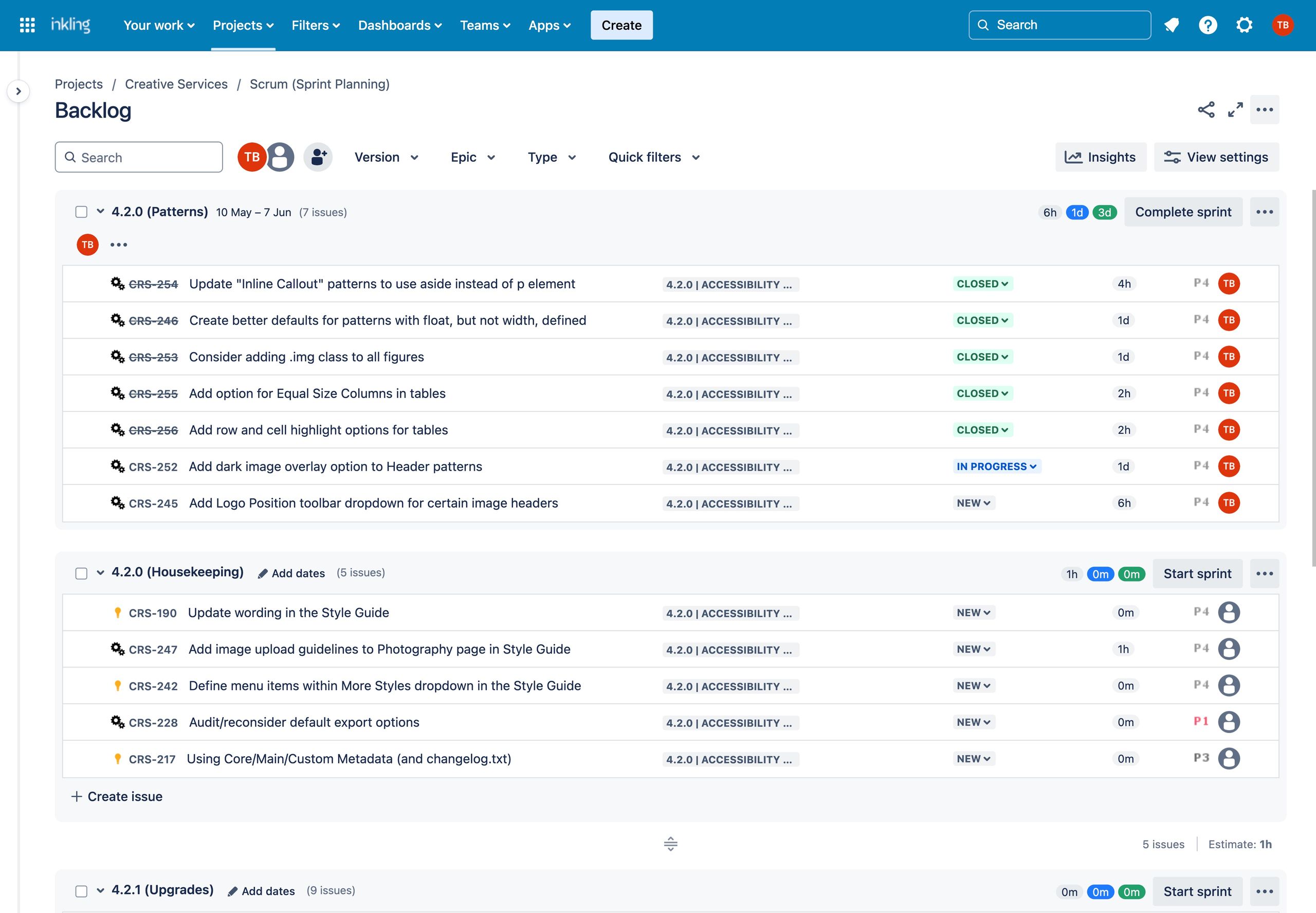
- Large backlog: Our Jira backlog accumulated to roughly 80 issues, which need substantial time and research to fix. Furthermore, these issues comprised bugs, ideas for improvement, and long-term upgrades, and nearly all needed cataloged with more detail, time estimates, and logical groupings.
- Not enough dedicated time: With heavy customer workloads, there often isn’t enough time in the year to dedicate fully to R&D.
- Integration with Product: Historically, Master Template and the Product side haven’t interacted or communicated enough to inform each other of their work and priorities. This de-prioritization has led to half-baked workarounds and a lack of support for research and building new features.
Vision and Process. After becoming well-versed in how we build our templates, I set out to take the helm of our R&D process. I achieved significant progress individually and cross-functionally as the solo designer:
- Released six new versions of Master Template with substantial authoring/user interaction fixes
- Took full accountability for the codebase, processes, documentation, and training/company outreach
- Partnered with teams within the company to evolve its integration with Product and Engineering
- Brought back regular meetings with the Professional Services team to share sprint progress, get feedback, and solicit QA testing needs
- Gained deep familiarity and confidence with the Master Template backlog and process in general
More recently, I advanced this integration by establishing a development roadmap, driving advocacy, and facilitating tighter team coordination and communication.
First, I drafted high-level, long-term goals for Master Template, then detailed a roadmap to identify priorities and collaboration requirements. I’ve been meeting regularly with a Product Manager each month to voice concerns, share progress on our respective initiatives, and support each other. It’s been tremendously helpful to stay informed more deeply regarding roadmap items. I’ve also resolved product- and platform-level questions through our partnership, which has supported me in completing R&D issues.
Beyond this 1:1 collaboration, I’ve even involved other departments like UX and Engineering to provide feedback, gather knowledge (e.g., accessibility and screen readers), and learn about opportunities. Staying in sync has proved crucial as more Habitat features continue to be developed and released.
Results. Over two years, I’ve reduced our backlog by 90% (70+ issues completed), documented release notes for each new version, and triaged new issues with greater detail. For many new patterns and improved functionality on existing ones, I’ve used modern CSS like :has() and aspect-ratio to progressively enhance current features and reduce the amount of code written. I also identified and removed over 100 unused patterns from the codebase to speed up development and implementation tasks.
This work has unlocked our ability to simplify, streamline, and create parity between the Figma boilerplate and Master Template.
