Exploring my web design process
These past two weeks I've been exercising my visual/web design skills by redesigning a site for a dream client. I started out by brainstorming a list of industries I care about and would like to work with. Ultimately, I was drawn toward the music, tech, editorial/news, and design industries.
I landed on Princeton Architectural Press, a publishing company that is adjacent to the design world, as a client to practice with. Below are some snippets of information about the brand from my research:
Founded in 1981, Princeton Architectural Press publishes fine books on art, architecture, design, photography, landscape, and visual culture, with over 1,000 titles to date.
PAPress has made their reputation in part by identifying new trends and publishing first books on emerging talents, as well as definitive works on established names, and by creating books of unsurpassed design quality and production values.
PAPress’ products have been described in professional and popular media as “visually inviting,” “elegant and charming,” “useful as well as beautiful,” “lovingly produced,” “authoritative,” “thorough and comprehensive,” and so on: we try to make books that are smart and beautiful.
PAPress’ mission is for surprising, inspiring, and informing those curious about the visual world.
I'm familiar with some of their books and authors from reading in college, and I really admire the quality of their products. Their current website, however, is not great. The site is visually underwhelming, missing functionality in places, and is cluttered with confusing pages.
For this mock project, I found it helpful to define an audience and goal:
Audience
The main audience for this website is people interested in design and visual culture—professionals, hobbyists, students, and educators. Visitors who land on this website will expect a highly functional, visually-appealing design that helps them achieve their particular goals. For example, a visitor may be looking to browse new releases, search for a particular book or author to find where to purchase it, or find the perfect book for a gift to a friend.
Goal
My goal with this redesign is to modernize the look & feel of the website to reflect the beauty and quality of their products, as well as align them to be competitive with other leading publishers. In addition, the site redesign should focus on usability, creating a simpler way for visitors to achieve their e-commerce goals.
I then spent a day or so researching inspiration and competing sites in the publishing, art, and retail spaces. This helped me gain a better sense of what other companies are doing, particularly in regards to e-commerce UX:

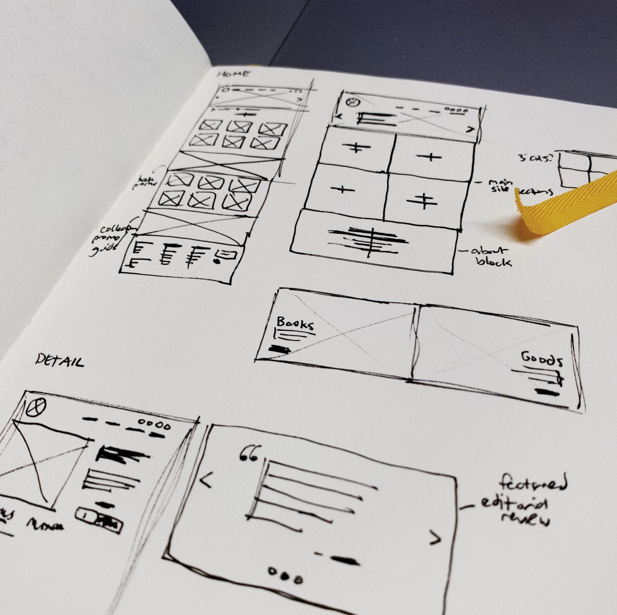
Next, I tried to make sense of their existing sitemap by listing out all of their pages and arranging them in new logical groupings. Reordering the pages was challenging since they include many categories and footer pages on their current site. Although my notes for this section are quite messy, I came up with a plan that promotes the main product categories themselves, with additional sub-pages for secondary categories. This way, it is clear up front what PAPress sells and what they're about.
At this point, I also began sketching wires for the homepage and e-commerce detail page. I wanted to transform the product carousel that exists on their homepage currently into a much more visual slider in the header. In these rough sketches, I also experimented with new components for things like promo blocks:
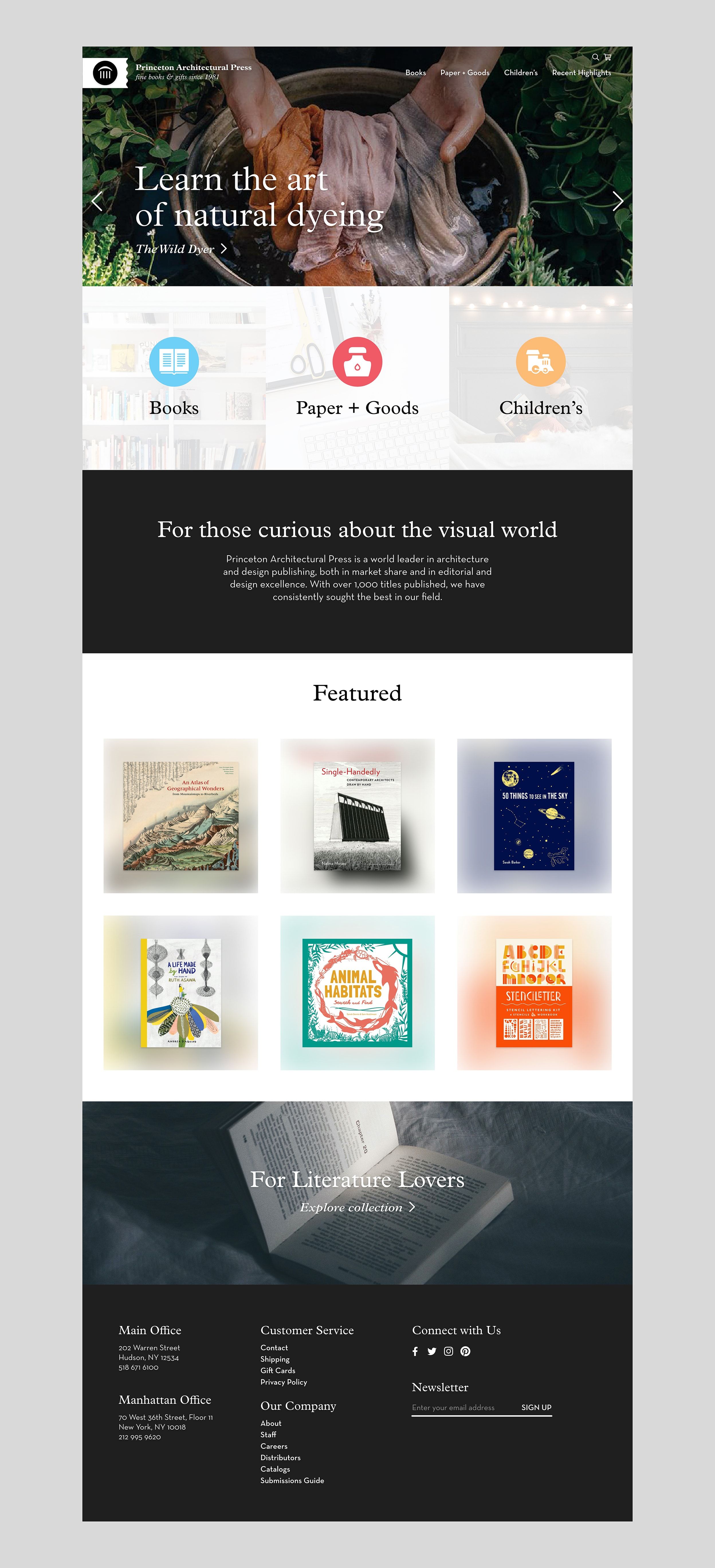
Using these ideas and research, as well as looking at their catalogs, I developed a refreshed look for the homepage that adheres to their brand while becoming much more visual and engaging. See below for my current homepage design concept:
Overall, I'm content with the progress I've made so far and I'm looking forward to working on a couple detail pages and responsive layouts to really flesh out this project. This exercise has shown me so far that there's a lot of knowledge and ability I've accumulated over time, but still some areas to improve when it comes to my design process.