Four Rules for Good Web Design
Four Rules for Good Web Design PDF - http://markusvogl.com/web1/web_4rules.pdf
Rule #1 Symmetrical - bad

Spotify Taste Rewind - https://spotify-tasterewind.com/
Asymmetry of layout is used in this site to give a more interesting feel.
Rule #2 White Space - good
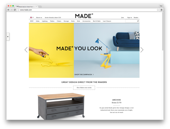
Made - http://www.made.com/
Negative space and padding is used in this e-commerce site to help the viewer focus on the products being sold.
Rule #3 Less is more

Truth Labs - http://truthlabs.com/
This design agency puts their purpose as the focal point of the homepage, while making secondary information available when you click through.
Rule #4 Contrast is key

Lowdi - http://lowdi.com/
Contrast of color (warm yellow vs. cool blue and black)

Bloomberg Business - http://www.bloomberg.com/
Contrast of direction/position (center & horizontal element vs. off-center & vertical element)

The UK Energy Consumption Guide - http://www.evoenergy.co.uk/uk-energy-guide/
Contrast of size (large vs. small data)

Van Gogh Museum - http://www.vangoghmuseum.nl/en
Contrast of texture (rounded sans-serif type vs. textured background)